Part 2/6 - Visualize Strava routes easily with amazing Python libraries
Last week you learned all about GPX data. You’ve also exported your Strava route in GPX format, loaded it with Python, and extracted key data points, such as latitude, longitude, and elevation. Today you’ll use these points to draw the route on a map!
We’ll start visualizing Strava routes with Matplotlib, but we’ll quickly transition to a more specialized library - Folium. Install it with Pip if you haven’t already (pip install folium). Let’s begin.
Don’t feel like reading? Watch my video instead:
You can download the source code on GitHub.
How to Read a Strava Route Dataset
We won’t bother with GPX files today, as we already have route data points extracted to a CSV file. To start, we have to import a couple of libraries - Pandas and Folium primarily - but also Matplotlib for a basic route visualization:
import folium
import pandas as pd

import matplotlib.pyplot as plt
plt.rcParams['axes.spines.top'] = False
plt.rcParams['axes.spines.right'] = False
from IPython.display import display
You can now load the route dataset:
route_df = pd.read_csv('../data/route_df.csv')
route_df.head()
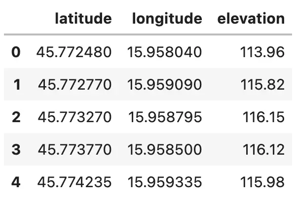
Image 1 - Strava route dataset (image by author)
There are 835 data points available in the dataset, which is more than enough for a representative route visualization. Let’s start with Matplotlib and discuss why that isn’t a good idea.
How to Visualize Strava Routes with Matplotlib
You can visualize latitude and longitude points as a scatter plot with Matplotlib - longitude on the X-axis, and latitude on the Y-axis. That’s quite limiting, as you’ll only see the route itself without the underlying map:
plt.figure(figsize=(14, 8))
plt.scatter(route_df['longitude'], route_df['latitude'], color='#101010')
plt.title('Route latitude and longitude points', size=20);
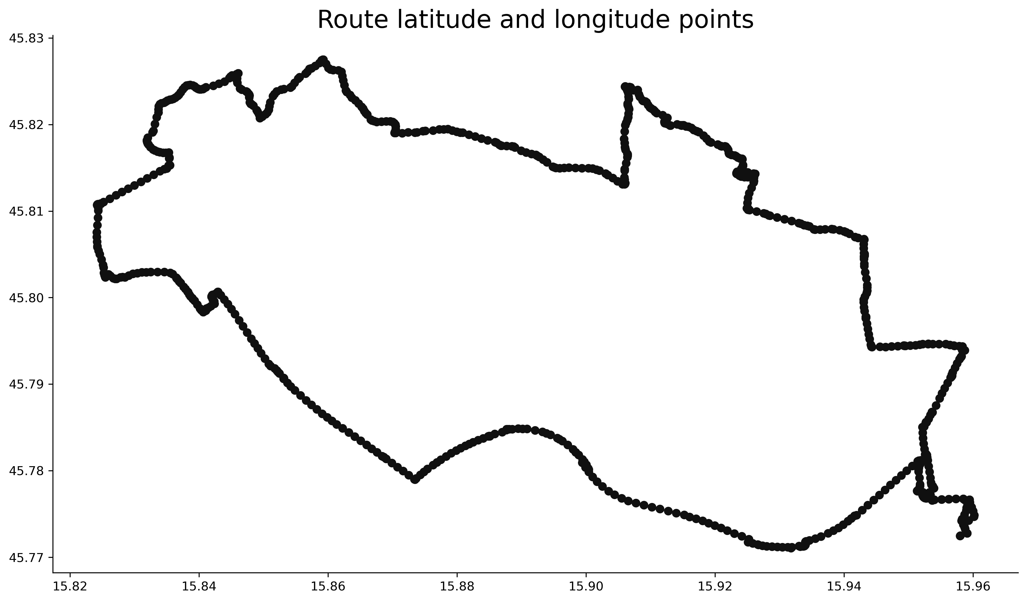
Image 2 - Strava route visualization with Matplotlib (image by author)
For that reason, I can’t recommend Matplotlib or any other non-specialized visualization package for displaying maps. There are many dedicated solutions, but I’ve found Folium to be the easiest one to work with.
How to Visualize Strava Routes with Folium
Folium is a Python library used to visualize geospatial data. It’s just a wrapper for Leaflet, an open-source JavaScript library for plotting interactive maps.
Folium has to know a couple of things before it can display a map. These are geolocation (latitude and longitude), zoom level, and tiles (how the map looks like). We’ll also add height and width, just so the map isn’t too big:
route_map = folium.Map(
    location=[45.79757947, 15.9007929],
    zoom_start=13,
    tiles='OpenStreetMap',
    width=1024,
    height=600
)
display(route_map)
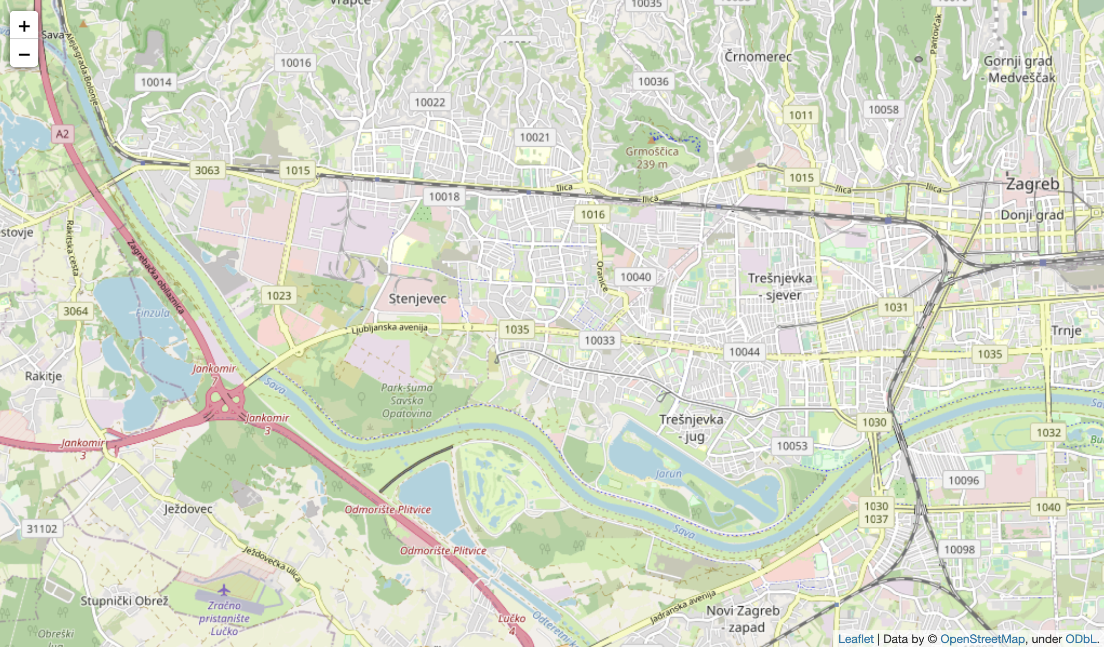
Image 3 - A blank Folium map in Zagreb, Croatia (image by author)
Simple, right? It’s a plain and empty map of western Zagreb, Croatia, as that’s the place of my route. Adding data points to the map is straightforward - you basically iterate over the dataset and add a circle marker at each latitude and longitude combination. We’ll keep the parameters to default - the only thing we’ll change is the circle radius:
route_map = folium.Map(
    location=[45.79757947, 15.9007929],
    zoom_start=13,
    tiles='OpenStreetMap',
    width=1024,
    height=600
)

for _, row in route_df.iterrows():
    folium.CircleMarker(
        location=[row['latitude'], row['longitude']],
        radius=3,
    ).add_to(route_map)

display(route_map)
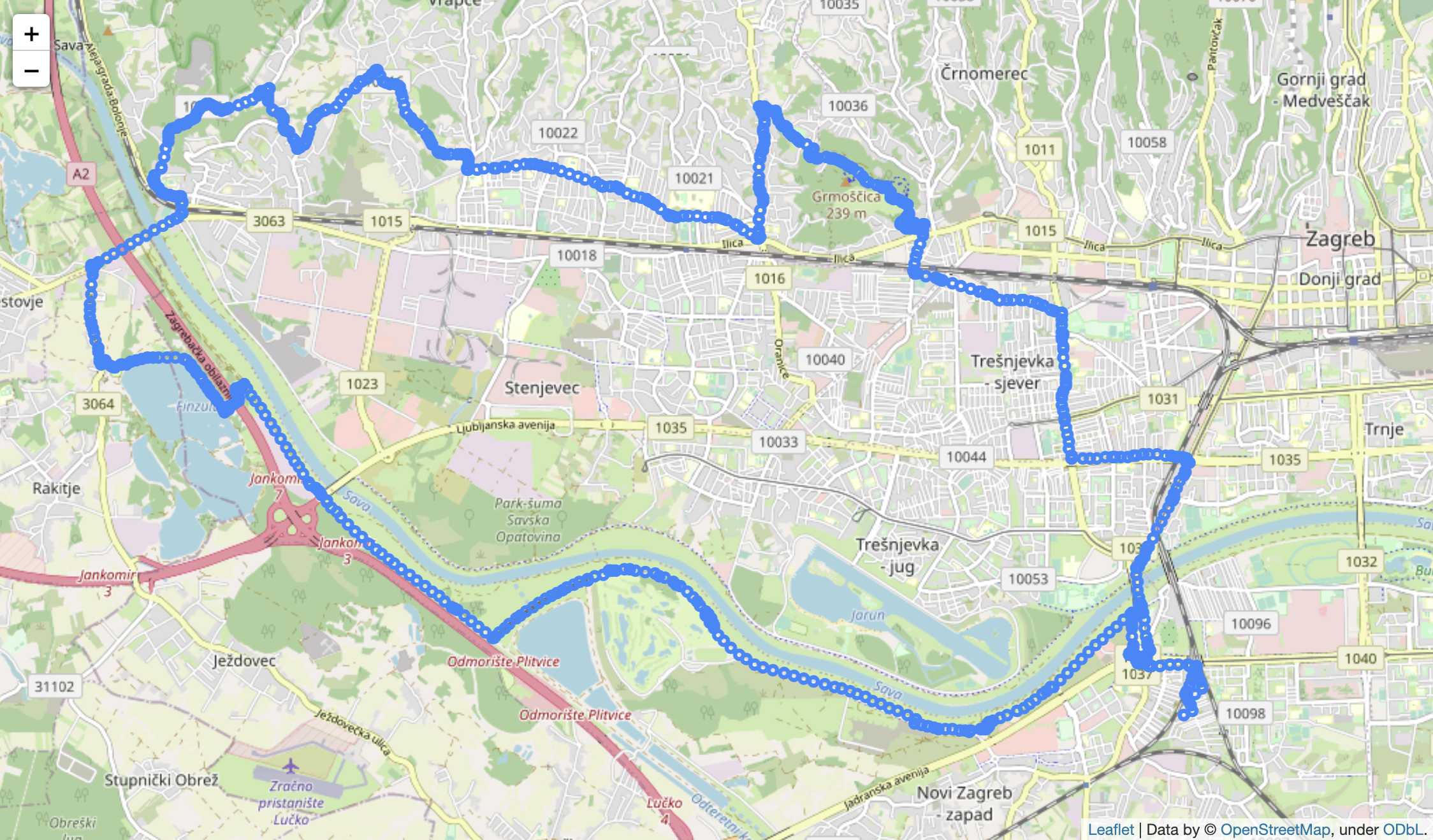
Image 4 - Visualizing Strava route with circle markers (image by author)
Now we’re getting somewhere. The only problem is - routes aren’t usually represented with circle markers. It’s a bit problematic since all we have are data points. We can connect them in a polygon line, but doing so requires extracting geolocation info as a list of tuples:
route_map = folium.Map(
    location=[45.79757947, 15.9007929],
    zoom_start=13,
    tiles='OpenStreetMap',
    width=1024,
    height=600
)

coordinates = [tuple(x) for x in route_df[['latitude', 'longitude']].to_numpy()]
folium.PolyLine(coordinates, weight=6).add_to(route_map)

display(route_map)
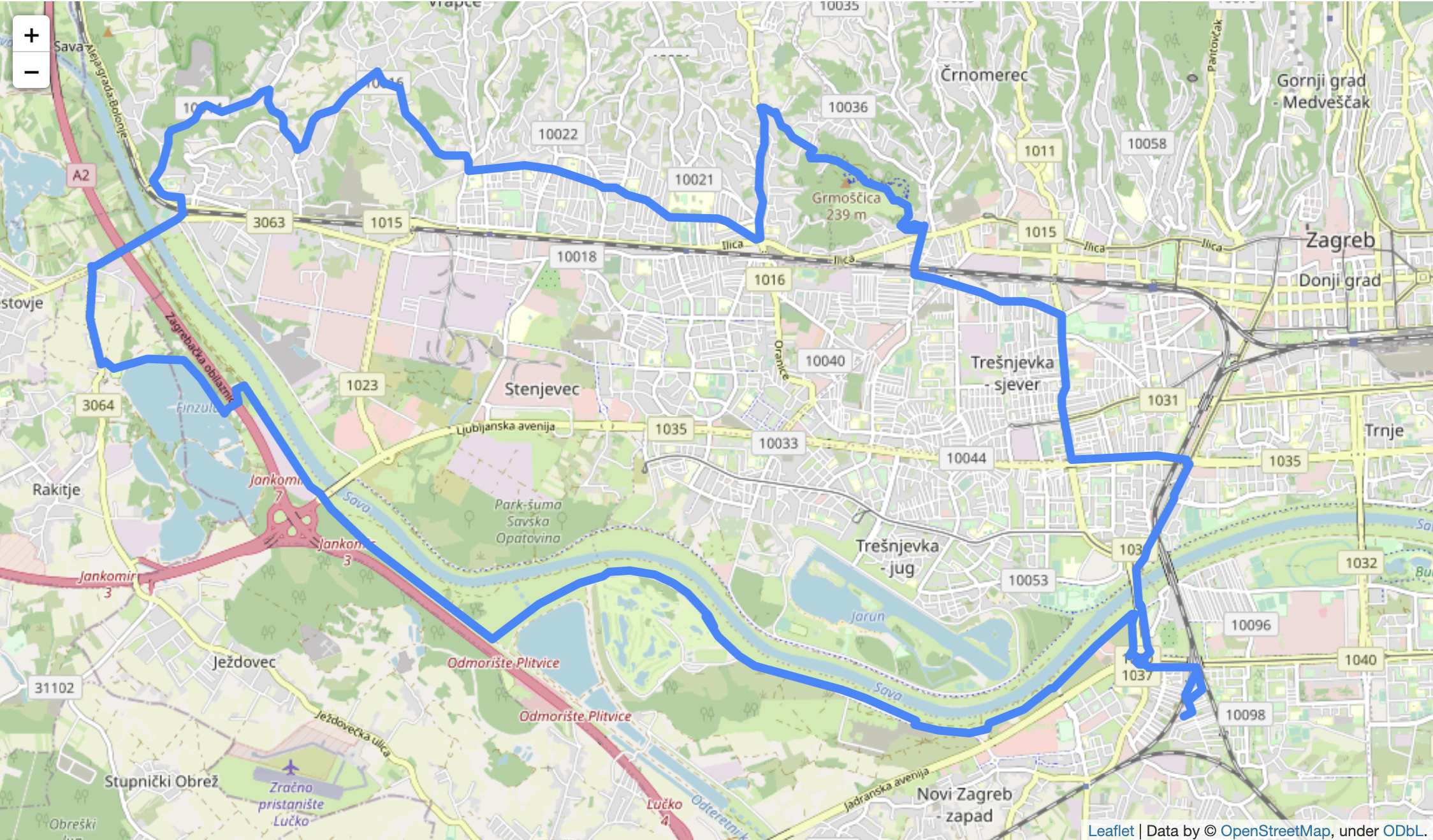
Image 5 - Visualizing Strava route with polygon lines (image by author)
Essentially, there’s less code for you to write and the map ends up looking better - win-win.
But what if you’re not satisfied with the overly detailed map? Here’s the good news - you can adjust the tiles parameter to your liking. Here’s an example of CartoDBPositron, light and minimalistic tile option:
route_map = folium.Map(
    location=[45.79757947, 15.9007929],
    zoom_start=13,
    tiles='CartoDBPositron',
    width=1024,
    height=600
)

coordinates = [tuple(x) for x in route_df[['latitude', 'longitude']].to_numpy()]
folium.PolyLine(coordinates, weight=6).add_to(route_map)

display(route_map)
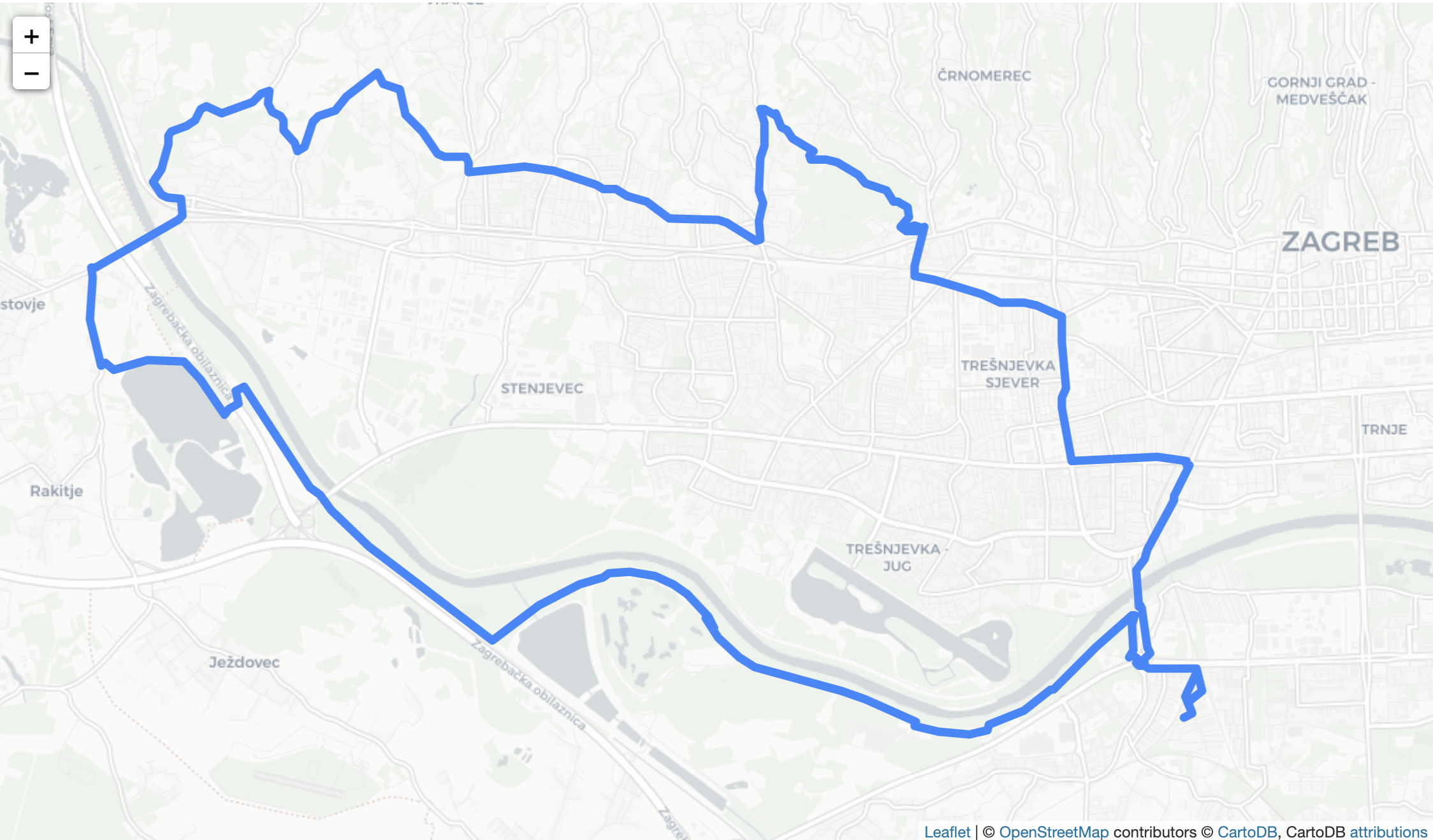
Image 6 - Changing map tiles (1) (image by author)
You can also go in the opposite direction, which is using a dark theme. To do so, change the tiles parameter to CartoDBDark_Matter:
route_map = folium.Map(
    location=[45.79757947, 15.9007929],
    zoom_start=13,
    tiles='CartoDBDark_Matter',
    width=1024,
    height=600
)

coordinates = [tuple(x) for x in route_df[['latitude', 'longitude']].to_numpy()]
folium.PolyLine(coordinates, weight=6).add_to(route_map)

display(route_map)
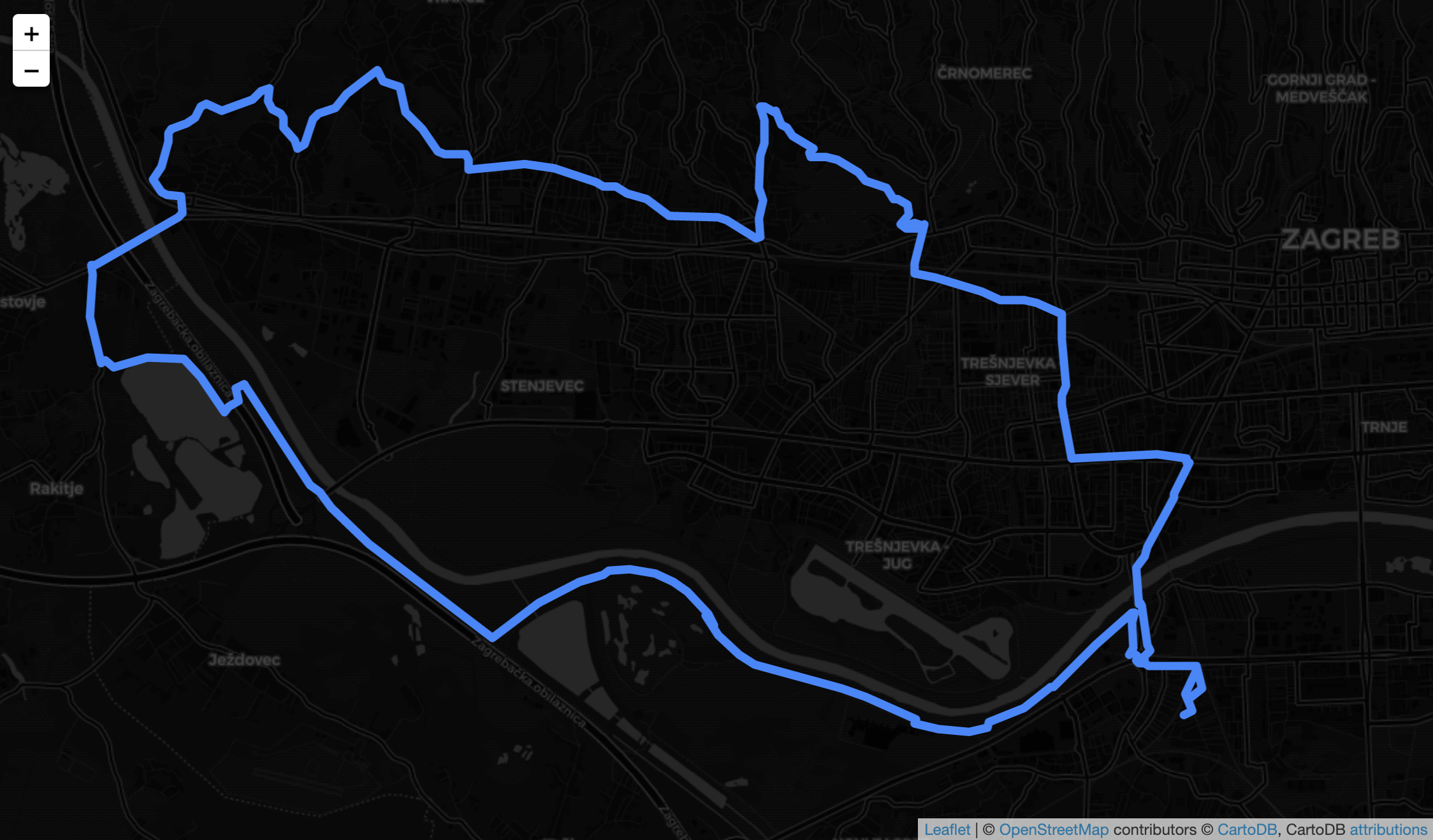
Image 7 - Changing map tiles (2) (image by author)
It looks a bit strange at first, but you could make it work. For example, changing the polygon line color to, let’s say, white, would make it stand out even more.
You can explore additional tiles by checking the docstring - here are the available options:
folium.Map?

Image 8 - Available map tiles in Folium (image by author)
Everything besides Mapbox is available, as Mapbox requires an API key. We’ll stick with the free options, as they are good enough.
Conclusion
And there you have it - how to visualize GPX Strava routes easily with Folium. We won’t do anything more complex with maps, as this alone suits our needs perfectly fine. You’ll learn how to calculate elevation difference and distance between data points in the following article, and much more in the ones after it.
Stay connected
- Sign up for my newsletter
- Subscribe on YouTube
- Connect on LinkedIn

