Matplotlib visualizations don’t have to be an eyesore - These tips will help.
If I had to summarize Matplotlib in one sentence, it would be the following - Easy to use, hard to look at. It’s no secret that Matplotlib charts don’t look the best by default, so many data professionals opt for a different data visualization library. You can implement some easy tweaks, and these will make a night and day difference.
To start, we’ll need a dataset to visualize. The Iris dataset will do just fine since we don’t need any complexity here. The following snippet loads it into Python as a Pandas DataFrame:
import pandas as pd
import matplotlib.pyplot as plt

df = pd.read_csv("https://gist.githubusercontent.com/netj/8836201/raw/6f9306ad21398ea43cba4f7d537619d0e07d5ae3/iris.csv")
df.head()
Here’s what it looks like:
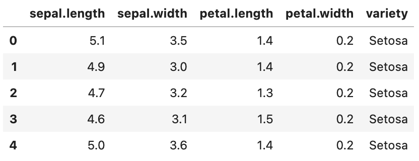
Image 1 - Iris dataset (image by author)
A simple scatter plot of Sepal length on the X-axis and Sepal width on the Y-axis will serve as a baseline. Here’s how to plot it:
plt.figure(figsize=(9, 5))

plt.plot(df["sepal.length"], df["sepal.width"], "rs")
plt.xlabel("Sepal length")
plt.ylabel("Sepal width")
plt.title("Iris dataset - Sepal length vs. Sepal width")
plt.show()
As you would imagine, it doesn’t look the best:
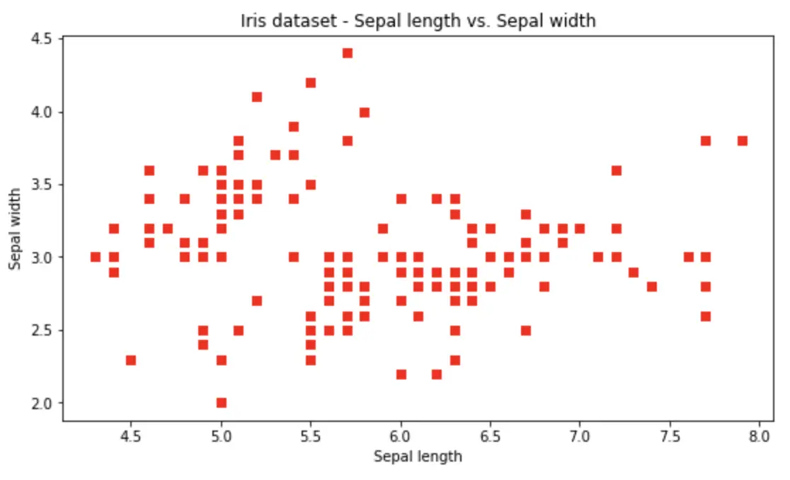
Image 2 - The default Matplotlib visualization (image by author)
The chart is boxy, blurry, and leaves a lot to be desired. Let’s start addressing these shortcomings one by one.
Tip #1 - Display Matplotlib Figures as SVG
The reason the previous Matplotlib figure was blurry is simple - it’s rendered as an image (pixels) instead of Scalable Vector Graphics (SVG). SVG allows you to scale and zoom the graphics however you want, and the quality will remain the same.
It sounds like magic, but how does it work with Matplotlib? Well, you can change the Matplotlib formats in a Notebook environment as follows:
from IPython import display
display.set_matplotlib_formats("svg")
That’s really all you have to do. If you’re using a Python script to generate a Matplotlib chart, use the following syntax to save it in SVG form:
plt.savefig("<figure-name>.svg")
You can now run the exact same chart generation code as before:
plt.figure(figsize=(9, 5))

plt.plot(df["sepal.length"], df["sepal.width"], "rs")
plt.xlabel("Sepal length")
plt.ylabel("Sepal width")
plt.title("Iris dataset - Sepal length vs. Sepal width")
plt.show()
The difference in image quality is night and day:

Image 3 - Matplotlib figure as SVG (image by author)
The quality remains the same even if you zoom in to a chart segment, as shown below:
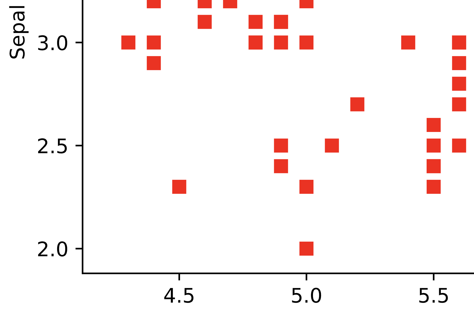
Image 4 - Zoomed in SVG figure (image by author)
In a nutshell, always use SVG. It’s by far a superior method, and it requires 1-2 lines of code, depending on whether you’re in a script or notebook environment.
Tip #2 - Tweak the Default Plotting Parameters
It can be quite tedious to specify figure size, title size, axes tick size, and many other parameters every time you want to make a chart. That’s why Matpltolib packs a configuration dictionary called rcParams. What’s even better is the fact you can change its key values however you want.
Take a look at the snippet below - it modifies the default figure size, removes the top and right borders, and tweaks the overall font sizing:
plt.rcParams["figure.figsize"] = 12, 6
plt.rcParams["axes.spines.top"] = False
plt.rcParams["axes.spines.right"] = False
plt.rcParams["font.size"] = 14
plt.rcParams["figure.titlesize"] = "xx-large"
plt.rcParams["xtick.labelsize"] = "medium"
plt.rcParams["ytick.labelsize"] = "medium"
You can now render any Matplotlib chart and the modified stylings will apply:
plt.plot(df["sepal.length"], df["sepal.width"], "rs")
plt.xlabel("Sepal length")
plt.ylabel("Sepal width")
plt.title("Iris dataset - Sepal length vs. Sepal width")
plt.show()
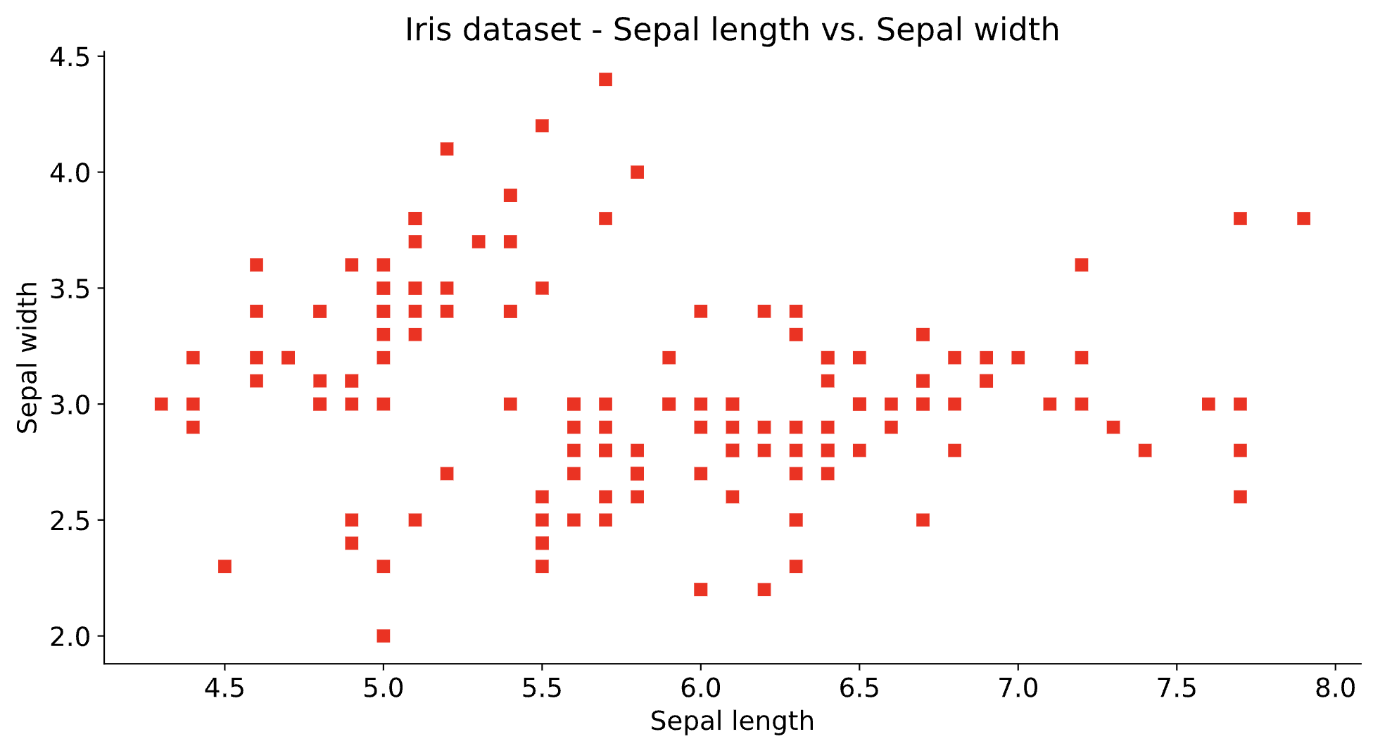
Image 5 - Matplotlib figure with tweaked rcParams (image by author)
You can keep these modified parameters in a separate document on your computer, and then paste them to any notebook that will use Matplotlib. No need to write them from scratch every time.
Tip #3 - Change the Font
This tip is probably the easiest way to add your company’s looks and feels to data visualizations. There are numerous ways to add custom fonts, but the one I’ll show works every time. There’s no need to install the font - you just have to have it downloaded.
For example, you can download Poppins from Google Fonts and extract the ZIP file. Once done, use Matplotlib’s font_manger to add fonts from a directory. Here’s everything available from Poppins:
import matplotlib.font_manager as font_manager

font_dir = ["/Users/dradecic/Desktop/Poppins"]
for font in font_manager.findSystemFonts(font_dir):
    print(font)
    font_manager.fontManager.addfont(font)
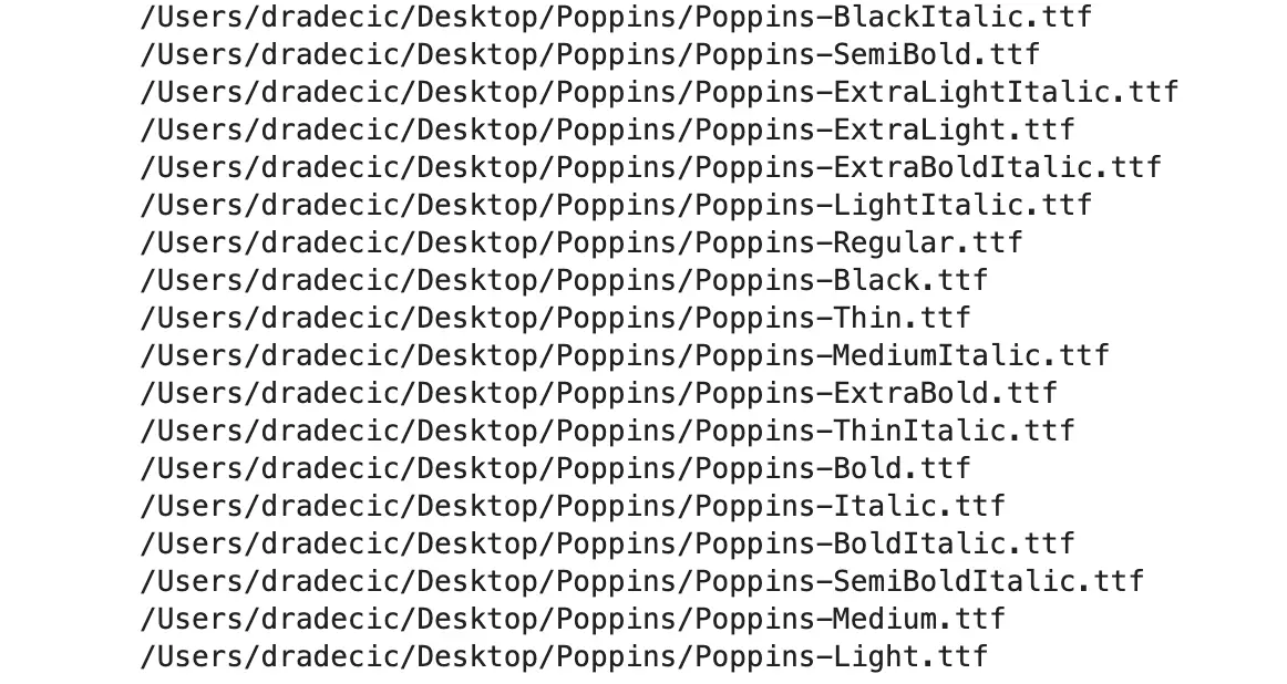
Image 6 - TTF fonts in a directory (image by author)
It’s quite a lot of font flavors, but how can you use them in Matplotlib? It’s easy, simply specify another rcParam:
plt.rcParams["font.family"] = "Poppins"

plt.plot(df["sepal.length"], df["sepal.width"], "rs")
plt.xlabel("Sepal length")
plt.ylabel("Sepal width")
plt.title("Iris dataset - Sepal length vs. Sepal width")
plt.show()
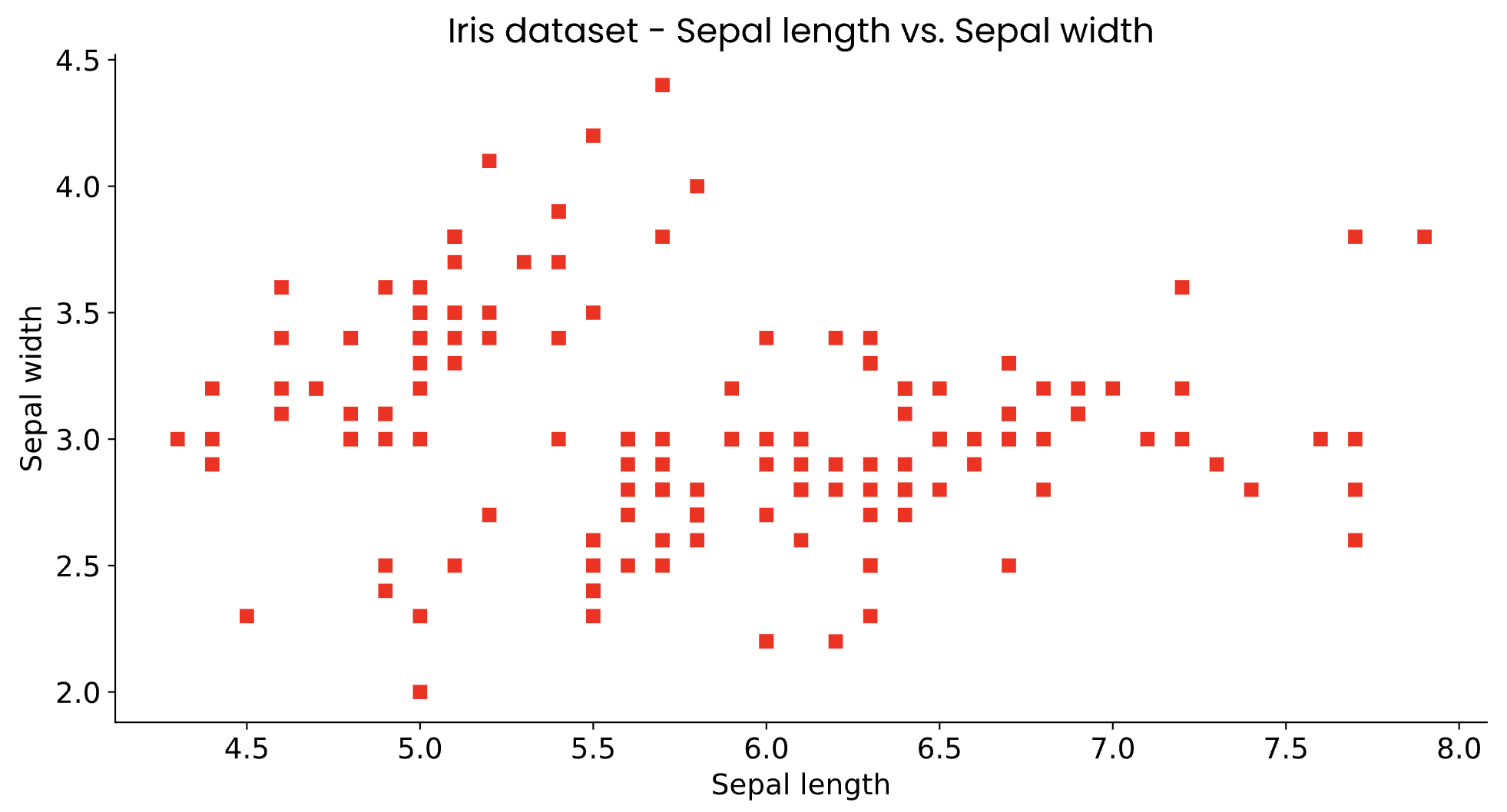
Image 7 - Matplotlib figure with a custom font (image by author)
Needless to say, this approach will work with any TTF font you can find.
Summary of 3 Matplotlib Styling Tips
Matplotlib doesn’t look the best by default - I’ll give you that - but it’s highly customizable. There are no limits to what you can do with regard to rendering static visualizations. The only question is how far you’re willing to dig over the documentation and code samples. If you need interactive charts, Plotly might be a good solution.
What are your top tips for working with Matplotlib? Is there some set of parameters you use in every project? Please let me know in the comment section below.
Recommended reads
- 5 Best Books to Learn Data Science Prerequisites (Math, Stats, and Programming)
- Top 5 Books to Learn Data Science in 2022
- 7 Ways to Print a List in Python
Stay connected
- Hire me as a technical writer
- Subscribe on YouTube
- Connect on LinkedIn

