Make your DataFrames stunning with this complete guide for beginners.
Python’s Pandas library allows you to present tabular data in a similar way as Excel. What’s not so similar is the styling functionality. In Excel, you can leverage one-click coloring or conditional formatting to make your tables stand out. In Pandas, well, it’s a bit trickier.
The good news is - the Style API in Pandas is here to help. I was completely unaware of it until recently, and it’s one of those things I wish I discovered sooner. I spent too many hours aggregating data in Python and Pandas and then copying the result to Excel for styling.
Sounds familiar? Good, let’s get going!
The Dataset
Before diving into the good stuff, we have to take care of the dataset. The code snippet you’ll see below creates one for you. It has four columns, each having 5 arbitrary values. Some values are missing as well, for the reasons you’ll see shortly:
import numpy as np
import pandas as pd

df = pd.DataFrame({
    "A": [0, -5, 12, -4, 3],
    "B": [12.24, 3.14, 2.71, -3.14, np.nan],
    "C": [0.5, 1.2, 0.3, 1.9, 2.2],
    "D": [2000, np.nan, 1000, 7000, 5000]
})
df
Here’s what the dataset looks like:
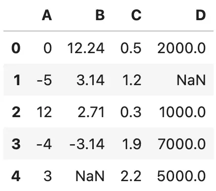
Image 1 - Made-up dataset (image by author)
It’s a pretty standard Pandas output, one which looks familiar and, let’s face it, boring. Up next, you’ll learn how to spice it up.
Basic Formatting with Pandas Styles
Pandas packs a Styles API that allows you to change how the DataFrame is displayed. There are many built-in styling functions, but there’s also the option to write your own.
One thing I find annoying most of the time is the index column. It’s just a sequence, and provides no real-world value for table visualization. Use the hide() method to get rid of it:
df.style.hide(axis="index")
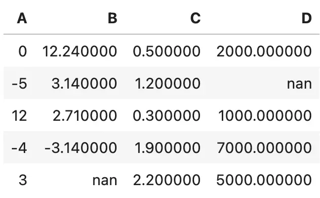
Image 2 - Hiding the dataframe index (image by author)
Much better!
There are other things that make our DataFrame painful to look at. For example, the precision of these decimal numbers is unnecessary. For visualization purposes, two decimal places are enough most of the time:
df.style.format(precision=2)
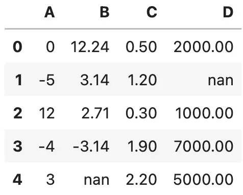
Image 3 - Specifying value precision (image by author)
You can take the whole story a step further and specify a custom formatting string. The one below will add a minus sign before and after each value, and also format each number to three decimal places:
df.style.format("- {:.3f} -")
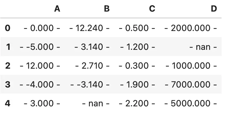
Image 4 - Custom value formatting style (image by author)
Things don’t end here. Sometimes, you want different formatting for each column. Specify the formatting string as key-value pairs and you’ll be good to go:
df.style.format({
    "A": "{:.2f}",
    "B": "{:,.5f}",
    "C": "{:.1f}",
    "D": "$ {:,.2f}"
})
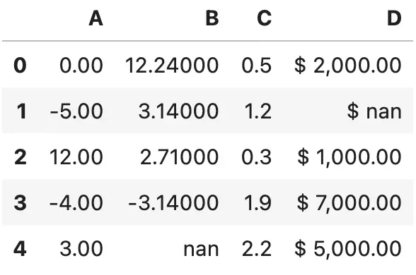
Image 5 - Specifying formatting styles for each column (image by author)
That does it for the basics of formatting. Next, we’ll go over numerous ways to change the text and background color - and much more.
Use Pandas Styler to Change Text and Background Color
Usually, it’s a good idea to highlight data points you want to draw attention to. The convenient highlight_max() function assigns a yellow color to the largest value of every cell in a DataFrame:
df.style.highlight_max()
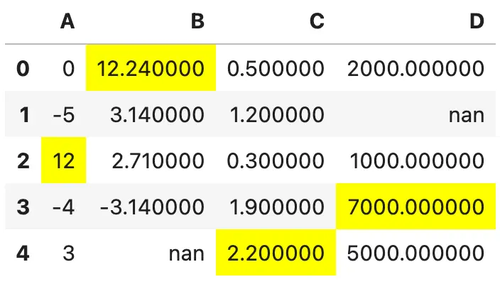
Image 6 - Highlighting max values (image by author)
The highlight_min() function does just the opposite:
df.style.highlight_min()
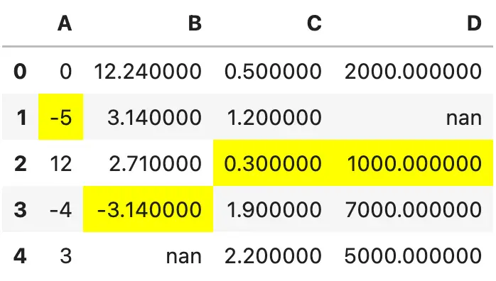
Image 7 - Highlighting min values (image by author)
In addition to min and max data points, you can also highlight the missing values. The example below shows you how to color cells without a value in red:
df.style.highlight_null(null_color="red")
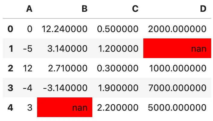
Image 8 - Highlighting null values (image by author)
If you’re not satisfied with the default nan printed, you can also format missing values with a custom string:
df.style.format(na_rep="Missing").highlight_null(null_color="red")
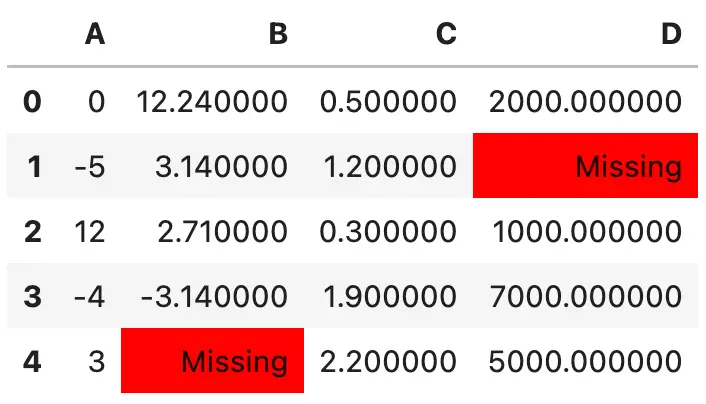
Image 9 - Highlighting null values (2) (image by author)
Neat! Let’s explore some other coloring options.
For example, the background_gradient() function will color the cells of individual rows with a gradient color palette. A bluish palette is used by default, and cells with higher values are filled with darker colors:
df.style.background_gradient()
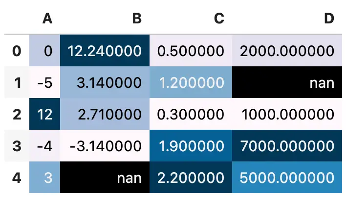
Image 10 - Using gradient palette for highlighting (image by author)
You don’t have to color the entire dataset - the subset parameter allows you to specify a list of columns you want to be colored:
df.style.background_gradient(subset=["B", "D"])
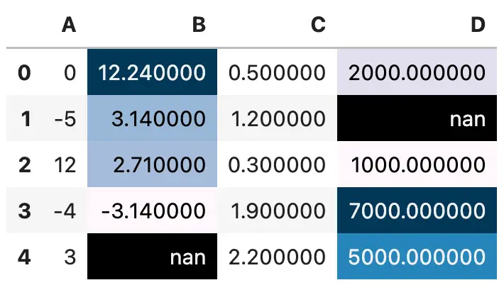
Image 11 - Using gradient palette for highlighting (2) (image by author)
There’s also a way to change the color palette and explicitly set minimum and maximum values. These parameters are available in both background_gradient() and text_gradient() functions. Let’s see how the latter one works first:
df.style.text_gradient(subset=["C"], cmap="RdYlGn", vmin=0, vmax=2.5)
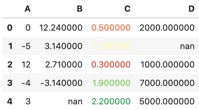
Image 12 - Using a custom gradient palette to change text color (image by author)
Nice, but not so easy on the eyes. The second value is somewhat hard to read. That’s why it’s better to color the entire cell, and not only the text:
df.style.background_gradient(subset=["C"], cmap="RdYlGn", vmin=0, vmax=2.5)
Image 13 - Using a custom gradient palette to change the background color (image by author)
Now let’s get into the really exciting stuff. We’ll explore the coloring of each cell as a bar chart. The “length” of a bar is represented by the value of the cell - the higher the value in relation to the rest of the column, the more of the cell gets colored.
To add bar coloring to your DataFrames, simply call the bar() function:
df.style.format(precision=2).bar(color="orange")
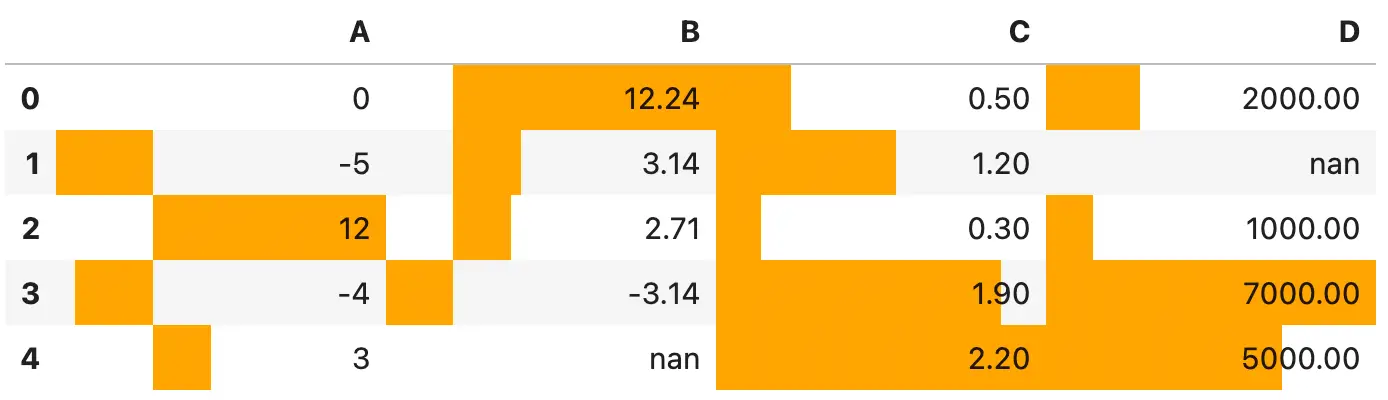
Image 14 - Value ranges as a bar chart (image by author)
It’s not the best-looking table by default. There are some columns with negative values, so the bar goes both ways with no visual distinction. It’s a bad design practice, to say at least.
Also, it would help if there were borders between cells. Otherwise, the fill color just melts with the surrounding ones:
df.style.format(precision=2).bar(align="mid", color=["red", "lightgreen"]).set_properties(**{"border": "1px solid black"})
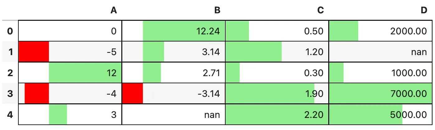
Image 15 - Value ranges as a bar chart (2) (image by author)
Much better!
If there was one point of concern many Pandas users have, that’s the text size. It’s too small if you’re working on a large monitor and don’t want to make everything bigger.
You can use the set_properties() function to pass in a dictionary of key-value pairs. Both keys and values come from CSS, and you’ll feel right at home if you have any experience with web design.
The code snippet below sets a thicker gray border, applies a green color to the text, and increases the overall text size:
properties = {"border": "2px solid gray", "color": "green", "font-size": "16px"}
df.style.set_properties(**properties)
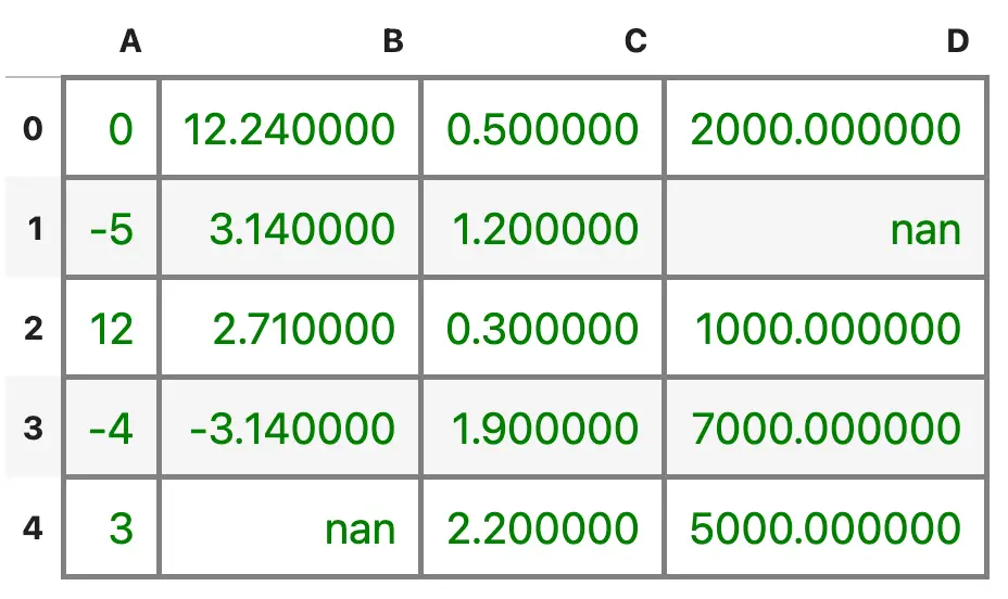
Image 16 - Changing text color and size (image by author)
That’s about enough for the basic stylings. Next, we’ll really make the table stand out with a couple of advanced examples.
Advanced: Style Header Row and Index Column
Table design, or design in general, is highly subjective. But there’s one thing all good-looking tables have in common - an easy-to-distinguish header row. In this section you’ll learn how to style:
- Table header row
- Table index column
- Table cells in a hover state
Let’s begin! We’ll declare three dictionaries - the first one is for the hover state, the second is for the index column, and the last one is for the header row. You can apply all of them to a DataFrame with the set_table_styles() function:
cell_hover = {
    "selector": "td:hover",
    "props": [("background-color", "#FFFFE0")]
}
index_names = {
    "selector": ".index_name",
    "props": "font-style: italic; color: darkgrey; font-weight:normal;"
}
headers = {
    "selector": "th:not(.index_name)",
    "props": "background-color: #800000; color: white;"
}

df.style.set_table_styles([cell_hover, index_names, headers])
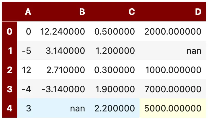
Image 17 - Table with styled header and index rows (image by author)
That’s a night and day difference from what we had before, but we can make it even better. For example, we can make all columns have the same width, center the cell content, and add a 1-pixel black border between them:
headers = {
    "selector": "th:not(.index_name)",
    "props": "background-color: #800000; color: white; text-align: center"
}
properties = {"border": "1px solid black", "width": "65px", "text-align": "center"}

df.style.format(precision=2).set_table_styles([cell_hover, index_names, headers]).set_properties(**properties)
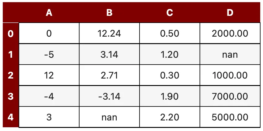
Image 18 - Table with styled header and index rows (2) (image by author)
Now that’s one great-looking table!
Next, let’s see how to declare styles conditionally based on the output of Python functions.
Advanced: Declare Custom Styles with Pandas Styler
Sometimes the built-in styles just won’t cut it. Luckily, you can apply your own as a result of Python functions.
Here’s an example: The mean_highlighter() function will:
- Color the cell red if the value is less than or equal to the mean
- Color the cell green if the value is greater than the mean
- Make the text white and bold in cases
Once outside the Python function, simply call apply() function from the Pandas Styles API:
def mean_highlighter(x):
    style_lt = "background-color: #EE2E31; color: white; font-weight: bold;"
    style_gt = "background-color: #31D843; color: white; font-weight: bold;"
    gt_mean = x > x.mean()
    return [style_gt if i else style_lt for i in gt_mean]


df.style.apply(mean_highlighter)
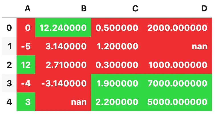
Image 19 - Using mean highlighter function (image by author)
Not the prettiest colors, but definitely an easy way to set up conditional formatting in Python.
One common use case would be to make the text color of a cell red if the value is negative. Here’s how you would implement that:
def negative_highlighter(x):
    is_negative = x < 0
    return ["color: #EE2E31" if i else "color: #000000" for i in is_negative]


df.style.apply(negative_highlighter)
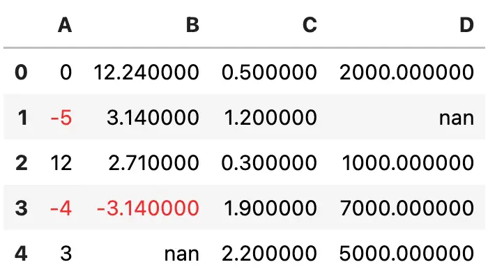
Image 20 - Using negative highlighter function (image by author)
And with that knowledge under our belt, there’s only one thing left to discuss - exporting your styled tables.
How to Export Styled Pandas DataFrame to Excel
The result of all Pandas Style API functions is a Pandas DataFrame. As such, you can call the to_excel() function to save the DataFrame locally. If you were to chain this function to a bunch of style tweaks, the resulting Excel file will contain the styles as well.
Here’s the code for exporting a gradient-based colored table:
df.style.background_gradient(cmap="RdYlGn").to_excel("table.xlsx")
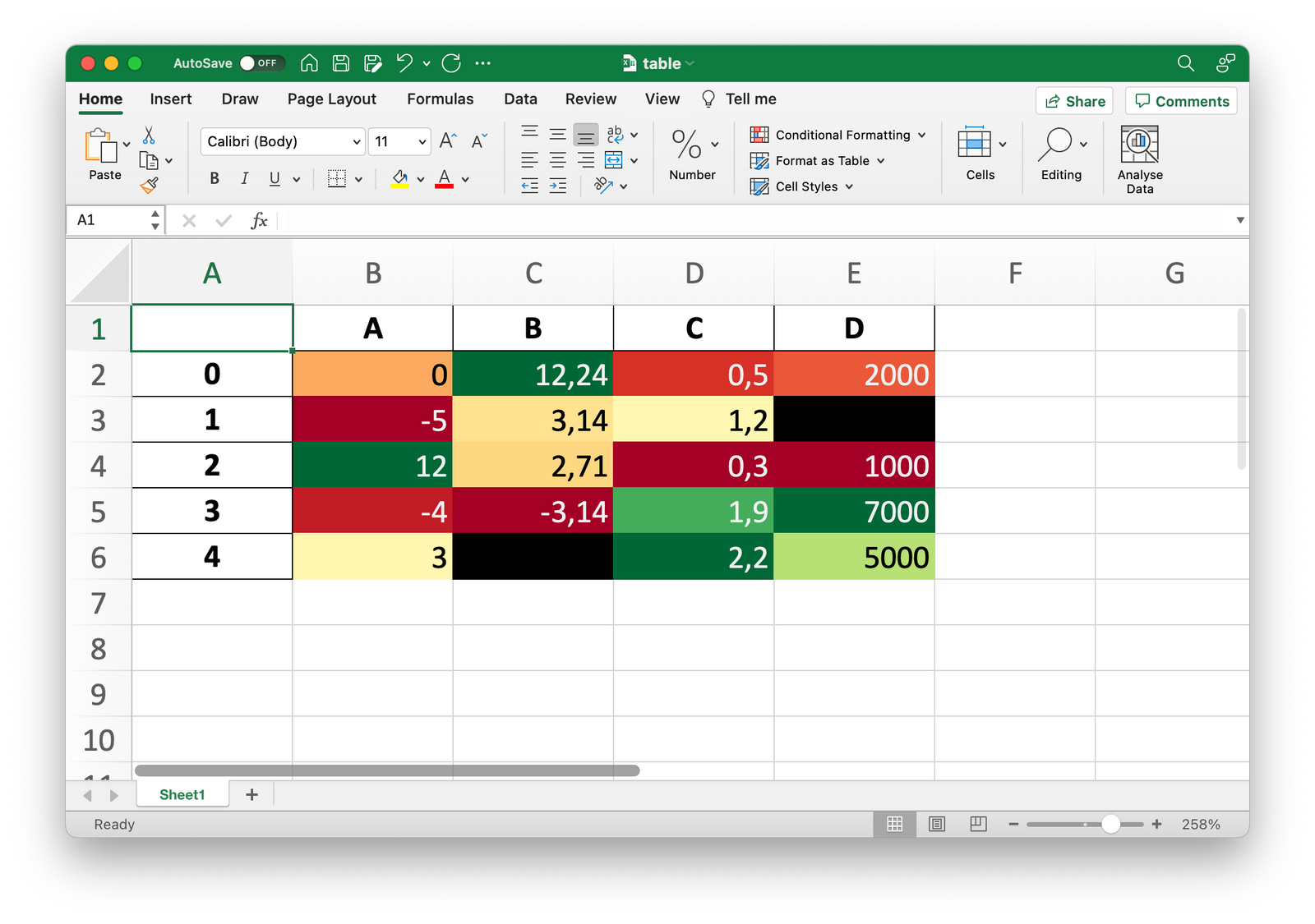
Image 21 - Exported Excel file (image by author)
It’s something you can do in Excel too, but is much simpler to implement in Pandas.
Summary of Pandas Style API
Today you’ve learned the ins and outs of the Pandas Style API. As I mentioned earlier, it’s an API I wish I learned sooner because it would save me so much time when working on presentations and papers.
There’s nothing you can’t do styling-wise with the tools and techniques you’ve learned today. Functions can be chained together when you want to apply multiple styles - for example, changing the number of decimal places and coloring the cells. Ordering matters, so keep that in mind.
What’s your favorite way to style Pandas DataFrames? Let me know in the comment section below.
Recommended reads
- 5 Best Books to Learn Data Science Prerequisites (Math, Stats, and Programming)
- Top 5 Books to Learn Data Science in 2022
- 7 Ways to Print a List in Python
Stay connected
- Hire me as a technical writer
- Subscribe on YouTube
- Connect on LinkedIn