
Explainable machine learning with a single function call
Nobody likes a black-box model. With sophisticated algorithms and a fair amount of data preparation, building good models is easy, but what’s going on inside? That’s where Explainable AI and SHAP come into place.
Today you’ll learn how to explain machine learning models to the general population. We’ll use three different plots for interpretation — one for a single prediction, one for a single variable, and one for the entire dataset.
After reading this article, you shouldn’t have any problems interpreting predictions of the machine learning model and the importance of each predictor.
The article is structured as follows:
- What is SHAP?
- Model training
- Model interpretation
- Conclusion
What is SHAP?
Let’s take a look at an official statement from the creators:
SHAP (SHapley Additive exPlanations) is a game-theoretic approach to explain the output of any machine learning model. It connects optimal credit allocation with local explanations using the classic Shapley values from game theory and their related extensions. (https://github.com/slundberg/sha_p)_)
It’s a lot of fancy words, but here’s the only thing you should know — SHAP helps us interpret machine learning models with Shapely values.
But what are Shapely values? Put simply, they are measures of contributions each predictor (feature) has in a machine learning model. This is the least fancy definition on the web, guaranteed, but I reckon it’s easy enough to understand.
Let’s start training our model next so that we can begin with the interpretation ASAP.
Model training
To interpret a machine learning model, we first need a model — so let’s create one based on the Wine quality dataset. Here’s how to load it into Python:
import pandas as pd
wine = pd.read_csv('wine.csv')
wine.head()
Wine dataset head (image by author)
There’s no need for data cleaning — all data types are numeric, and there are no missing data. The train/test split is the next step. The column quality is the target variable, and it can be either good or bad. To get the same split, please set the value of random_state to 42:
from sklearn.model_selection import train_test_split

X = wine.drop('quality', axis=1)
y = wine['quality']

X_train, X_test, y_train, y_test = train_test_split(X, y, test_size=0.2, random_state=42)
And now we’re ready to train the model. XGBoost classifier will do the job, so make sure to install it first (pip install xgboost). Once again, the value of random_state is set to 42 for reproducibility:
from xgboost import XGBClassifier

model = XGBClassifier(random_state=42)
model.fit(X_train, y_train)
score = model.score(X_test, y_test)
Out of the box, we have an accuracy of 80% (score). Now we have all we need to start interpreting the model. We’ll do that in the next section.
Model interpretation
To explain the model through SHAP, we first need to install the library. You can do it by executing pip install shap from the Terminal. We can then import it, make an explainer based on the XGBoost model, and finally calculate the SHAP values:
import shap

explainer = shap.TreeExplainer(model)
shap_values = explainer.shap_values(X)
And we are ready to go!
Explaining single prediction
Let’s start small and simple. With SHAP, we can generate explanations for a single prediction. The SHAP plot shows features that contribute to pushing the output from the base value (average model output) to the actual predicted value.
Red color indicates features that are pushing the prediction higher, and blue color indicates just the opposite.
Let’s take a look at an interpretation chart for a wine that was classified as bad:
shap.force_plot(explainer.expected_value, shap_values[0, :], X.iloc[0, :])
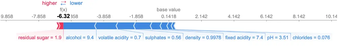
Interpretation for a bad-quality wine (image by author)
This is a classification dataset, so don’t worry too much about the f(x)value. Only the residual sugar attribute pushed this instance towards a good wine quality, but it wasn’t enough, as we can see.
Next, let’s take a look at the interpretation chart for a good wine:
shap.force_plot(explainer.expected_value, shap_values[3, :], X.iloc[3, :])
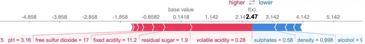
Interpretation for a good-quality wine (image by author)
A whole another story here. You now know how to interpret a single prediction, so let’s spice things up just a bit and see how to interpret a single feature’s effect on the model output.
Explaining single feature
To understand the effect a single feature has on the model output, we can plot a SHAP value of that feature vs. the value of the feature for all instances in the dataset.
The chart below shows the change in wine quality as the alcohol value changes. Vertical dispersions at a single value show interaction effects with other features. SHAP automatically selects another feature for coloring to make these interactions easier to see:
shap.dependence_plot('alcohol', shap_values, X)
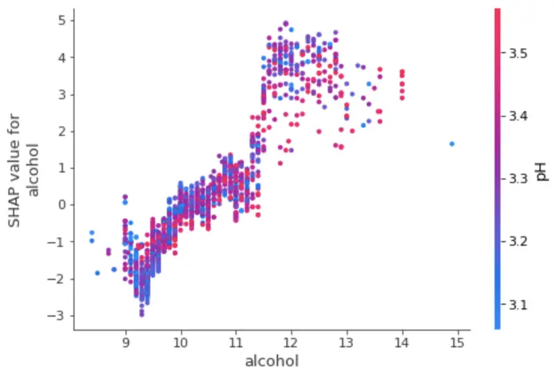
Interpretation of a single feature (image by author)
Let’s now examine the entire dataset to determine which features are most important for the model and how they contribute to the predictions.
Explaining the entire dataset
We can visualize the importance of the features and their impact on the prediction by plotting summary charts. The one below sorts features by the sum of SHAP value magnitudes over all samples. It also uses SHAP values to show the distribution of the impacts each feature has.
The color represents the feature value — red indicating high and blue indicating low. Let’s take a look at the plot next:
shap.summary_plot(shap_values, X)
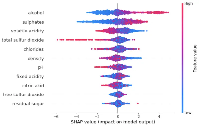
Interpretation for an entire model (image by author)
To interpret:
- High alcohol value increases the predicted wine quality
- Low volatile acidity increases the predicted wine quality
You now know just enough to get started interpreting your own models. Let’s wrap things up in the next section.
Parting words
Interpreting machine learning models can seem complicated at first, but libraries like SHAP make everything as easy as a function call. We even don’t have to worry about data visualization, as there are built-in functions for that.
This article should serve you as a basis for more advanced interpretation visualizations and provide you with just enough information for further learning.