Visualizing data beyond two dimensions isn’t a good idea — most of the time. That’s where radar charts come in, enabling you to visually represent one or more groups of values over multiple identically scaled variables.
Today you’ll learn how radar charts can visualize data across multiple dimensions, both with Matplotlib and Plotly. You’ll also learn what radar charts are and the pros and cons of using them.
The article is structured as follows:
- Introduction to Radar Charts
- Pros and Cons of Radar Charts
- Radar Charts with Matplotlib
- Radar Charts with Plotly
- Conclusion
You can download the corresponding Notebook here.
Introduction to Radar Charts
You most likely know what a radar chart is. Sometimes they’re referred to as spider charts or polar charts, but these terms represent the same idea. The goal of the radar chart is to visually represent one or more groups of values over multiple variables.
For example, let’s say you want to visually represent restaurants over some set of common variables — such as food quality, food variety, service quality, and others (spoiler alert: you’ll do that later). Radar charts should be a go-to visualization type for this scenario.
Each variable is given an axis, and axes are arranged radially around the center. Needless to say, but the axes are spaced equally. A single observation is then plotted along each axis like a scatter plot, but the points are then connected to form a polygon. You can reuse the same logic to plot multiple polygons in the same chart.
And that’s the basic idea behind radar charts. Let’s examine the pros and cons before diving into hands-on examples.
Pros and Cons of Radar Charts
Let’s talk about the pros first:
- Radar charts are excellent for visualizing comparisons between observations — you can easily compare multiple attributes among different observations and see how they stack up. For example, you could use radar charts to compare restaurants based on some common variables.
- It’s easy to see overall “top performers” — the observation with the highest polygon area should be the best if you’re looking at the overall performance.
But things aren’t all sunshine and rainbows, as you can see from the following cons list:
- Radar charts can get confusing fast — comparing more than a handful of observations leads to a mess no one wants to look at.
- It can be tough to find the best options if there are too many variables — just imagine seeing a radar chart with 20+ variables. No one wants to even look at it; God forbid to interpret it.
- The variables have to be on the same scale — it makes no sense to compare student grades (ranging from 1 to 5) and satisfaction with some service (ranging from 0 to 100).
You now know what radar charts are and when it makes sense to use them. You’ll learn how to draw them with Matplotlib next.
Radar Charts with Matplotlib
Matplotlib is a de facto standard data visualization library for Python, so that’s why we’re looking at it first.
The goal is to compare three restaurants among the following categories: food quality, food variety, service quality, ambiance, and affordability. All categories range from 1 to 5, so they are a perfect candidate for visualization with radar charts.
The following code snippet demonstrates how you can specify data and categories, label locations, and visualize the chart. There are a couple of things you should know beforehand:
label_locis a list that represents the label location in radiansplt.subplot(polar=True)must be used to make a radar chartplt.thetagrids()is used to place the category names on label locations
These might be confusing at first, but you’ll get the gist in no time. You can use the following code snippet to make the visualization:
import numpy as np
import matplotlib.pyplot as plt


categories = ['Food Quality', 'Food Variety', 'Service Quality', 'Ambiance', 'Affordability']

restaurant_1 = [4, 4, 5, 4, 3]
restaurant_2 = [5, 5, 4, 5, 2]
restaurant_3 = [3, 4, 5, 3, 5]

label_loc = np.linspace(start=0, stop=2 * np.pi, num=len(restaurant_1))

plt.figure(figsize=(8, 8))
plt.subplot(polar=True)
plt.plot(label_loc, restaurant_1, label='Restaurant 1')
plt.plot(label_loc, restaurant_2, label='Restaurant 2')
plt.plot(label_loc, restaurant_3, label='Restaurant 3')
plt.title('Restaurant comparison', size=20)
lines, labels = plt.thetagrids(np.degrees(label_loc), labels=categories)
plt.legend()
plt.show()
The figure is displayed below:
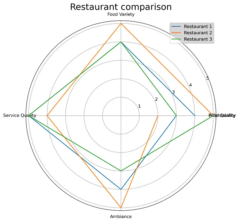
Image 1 — Your first radar chart (image by author)
A quick look at the previous figure indicates something is wrong. The last data point isn’t connected to the first one, and you’ll need to fix that somehow. There isn’t a 100% intuitive fix, but here’s what you should do: add an additional element to both categories and restaurants that’s identical to the first item.
You could do this manually, but what if you don’t know what the first value is? You can use the unpacking and indexing operations to solve this issue. Here’s how:
categories = ['Food Quality', 'Food Variety', 'Service Quality', 'Ambiance', 'Affordability']
categories = [*categories, categories[0]]

restaurant_1 = [4, 4, 5, 4, 3]
restaurant_2 = [5, 5, 4, 5, 2]
restaurant_3 = [3, 4, 5, 3, 5]
restaurant_1 = [*restaurant_1, restaurant_1[0]]
restaurant_2 = [*restaurant_2, restaurant_2[0]]
restaurant_3 = [*restaurant_3, restaurant_3[0]]

label_loc = np.linspace(start=0, stop=2 * np.pi, num=len(restaurant_1))

plt.figure(figsize=(8, 8))
plt.subplot(polar=True)
plt.plot(label_loc, restaurant_1, label='Restaurant 1')
plt.plot(label_loc, restaurant_2, label='Restaurant 2')
plt.plot(label_loc, restaurant_3, label='Restaurant 3')
plt.title('Restaurant comparison', size=20, y=1.05)
lines, labels = plt.thetagrids(np.degrees(label_loc), labels=categories)
plt.legend()
plt.show()
As you can see, it’s a bit tedious to write this logic every time (you could make a function out of it), but here’s how the radar chart looks now:
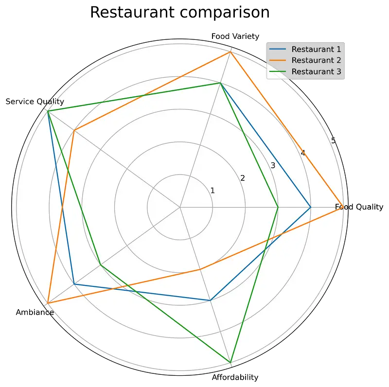
Image 2 — Fixing the data points connectivity in radar charts (image by author)
As you can see, a lot better!
Matplotlib isn’t widely recognized for its aesthetics, so let’s see how to produce better-looking visualization with Plotly next.
Radar Charts with Plotly
Plotly is something else. It’s easy to make highly-customizable, good-looking, and interactive charts with almost the same amount of code. Radar charts are no exception.
That doesn’t mean they’re immune to the issues Matplotlib was having. You still need to manually “close” the polygon, but the result is a somewhat better-looking visualization.
The following snippet produces the same visualization created earlier with Matplolib:
import plotly.graph_objects as go
import plotly.offline as pyo


categories = ['Food Quality', 'Food Variety', 'Service Quality', 'Ambience', 'Affordability']
categories = [*categories, categories[0]]

restaurant_1 = [4, 4, 5, 4, 3]
restaurant_2 = [5, 5, 4, 5, 2]
restaurant_3 = [3, 4, 5, 3, 5]
restaurant_1 = [*restaurant_1, restaurant_1[0]]
restaurant_2 = [*restaurant_2, restaurant_2[0]]
restaurant_3 = [*restaurant_3, restaurant_3[0]]


fig = go.Figure(
    data=[
        go.Scatterpolar(r=restaurant_1, theta=categories, name='Restaurant 1'),
        go.Scatterpolar(r=restaurant_2, theta=categories, name='Restaurant 2'),
        go.Scatterpolar(r=restaurant_3, theta=categories, name='Restaurant 3')
    ],
    layout=go.Layout(
        title=go.layout.Title(text='Restaurant comparison'),
        polar={'radialaxis': {'visible': True}},
        showlegend=True
    )
)

pyo.plot(fig)
The visualization is shown below:
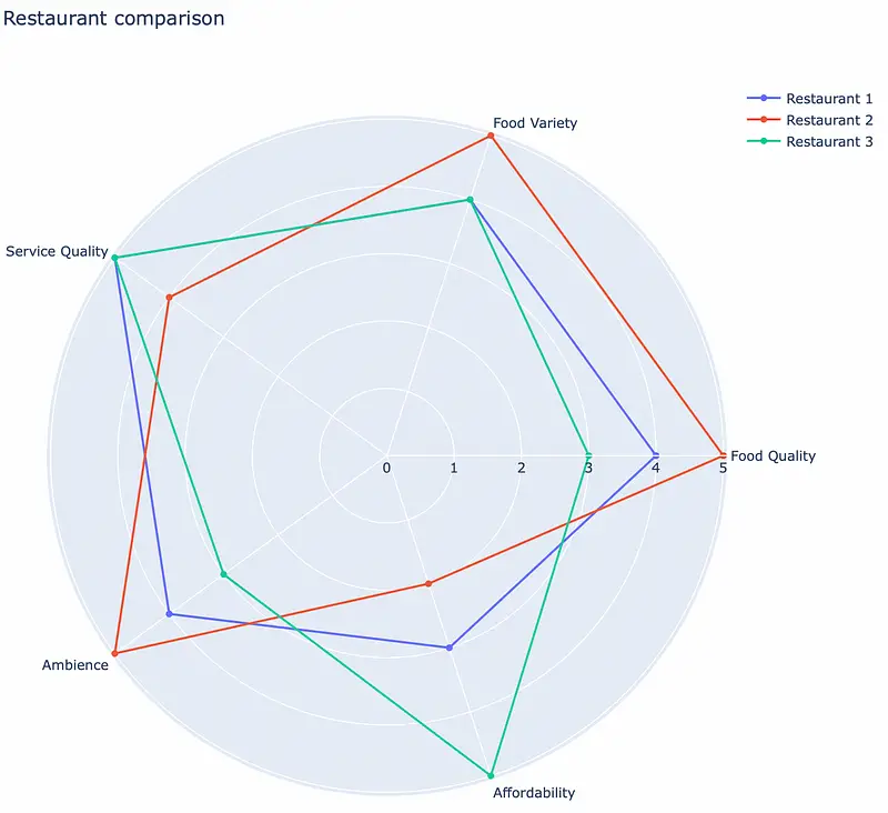
Image 3 — Radar chart with Plotly (image by author)
And that’s all there is to it! Plotly also makes it easy to fill the polygons — just specify fill='toself'. Here’s an example:
mport plotly.graph_objects as go
import plotly.offline as pyo


categories = ['Food Quality', 'Food Variety', 'Service Quality', 'Ambience', 'Affordability']
categories = [*categories, categories[0]]

restaurant_1 = [4, 4, 5, 4, 3]
restaurant_2 = [5, 5, 4, 5, 2]
restaurant_3 = [3, 4, 5, 3, 5]
restaurant_1 = [*restaurant_1, restaurant_1[0]]
restaurant_2 = [*restaurant_2, restaurant_2[0]]
restaurant_3 = [*restaurant_3, restaurant_3[0]]


fig = go.Figure(
    data=[
        go.Scatterpolar(r=restaurant_1, theta=categories, fill='toself', name='Restaurant 1'),
        go.Scatterpolar(r=restaurant_2, theta=categories, fill='toself', name='Restaurant 2'),
        go.Scatterpolar(r=restaurant_3, theta=categories, fill='toself', name='Restaurant 3')
    ],
    layout=go.Layout(
        title=go.layout.Title(text='Restaurant comparison'),
        polar={'radialaxis': {'visible': True}},
        showlegend=True
    )
)

pyo.plot(fig)
The visualization is shown below:
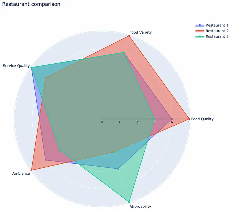
Image 4 — Filled radar chart with Plotly (image by author)
And that’s how easy it is to make radar charts with Plotly. Let’s wrap things up next.
Conclusion
Radar charts provide an excellent way to visualize one or more groups of values over multiple variables. Today you’ve learned how to do just that — with completely made-up restaurant satisfaction data.
Keep in mind the restrictions or cons of radar charts. They aren’t the best options if you want to visualize many observations, so stick to a single or a couple of them at most.
Stay connected
- Sign up for my newsletter
- Subscribe on YouTube
- Connect on LinkedIn

