
Make your visualizations extra catchy with custom fonts (TTF’s included)
Matplotlib visualizations can be an eyesore by default. Lucikly for you, a lot can be tweaked with a couple of lines of code. Today we’ll take a look at changing fonts and explain why it is generally a good idea.
The article is structured as follows:
- Custom fonts — Why?
- Using built-in fonts
- Using custom fonts from a TTF file
- Conclusion
Custom fonts — Why?
Why not? The default ones won’t get you far. If your company has a distinct branding, why not use it whenever possible?
Let’s take a look at how default stylings look like. There’s no data visualization without data, so let’s declare a simple dataset first. It contains dummy quarterly sales for an imaginary company:
import pandas as pd


df = pd.DataFrame(data={
    'Date': ['2019-Q1', '2019-Q2', '2019-Q3', '2019-Q4',
             '2020-Q1', '2020-Q2', '2020-Q3', '2020-Q4'],
    'Sales': [1234, 1268, 2244, 2533, 2131, 2008, 2244, 2533]
})
Here’s how the dataset looks like:
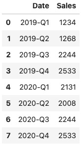
Image 1 — Dummy visualization dataset (image by author)
Let’s visualize this data with both line and scatter plots. We’ll keep most of the default stylings and just remove the top and right spines:
import matplotlib.pyplot as plt
from matplotlib import rcParams
rcParams['axes.spines.top'] = False
rcParams['axes.spines.right'] = False


plt.figure(figsize=(16, 8))
plt.plot(df['Date'], df['Sales'], c='#087E8B', lw=3)
plt.scatter(df['Date'], df['Sales'], c='#087E8B', s=200)
plt.title('Company X profit for 2019 and 2020', size=20)
plt.xlabel('Time Period', size=14)
plt.ylabel('Profit (Millions of US dollars)')
plt.show()
Here’s the visualization:
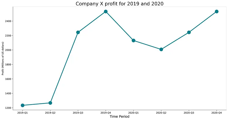
Image 2 — Visualization with default fonts (image by author)
As you can see, the fonts look decent, but I don’t know a single brand that uses DejaVu Sans as their font of choice. Let’s see how to change it next.
Using built-in fonts
Matplotlib makes it easy to use fonts installed on your machine. You can use the following code snippet to list the first ten available fonts:
import matplotlib.font_manager

matplotlib.font_manager.findSystemFonts(fontpaths=None, fontext='ttf')[:10]
Here are the results:
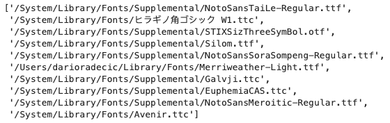
Image 3 — Preinstalled fonts (image by author)
Remove the [:10] if you want the entire list. You can specify the value for the font parameter to use a font of interest in either title or the axis labels.
The following code snippet shows you how to use Courier New font in the title:
plt.figure(figsize=(16, 8))
plt.plot(df['Date'], df['Sales'], c='#087E8B', lw=3)
plt.scatter(df['Date'], df['Sales'], c='#087E8B', s=200)
plt.title('Company X profit for 2019 and 2020', font='Courier New', size=20)
plt.xlabel('Time Period', size=14)
plt.ylabel('Profit (Millions of US dollars)')
plt.show()
Here’s how the visualization looks like:
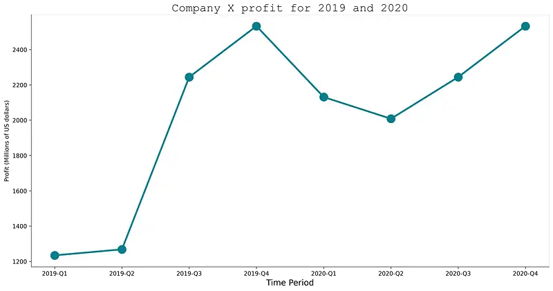
Image 4 — Visualization with a preinstalled system font (image by author)
But did you know there’s no need to install the font before using it? All you need is a TTF file. Let’s explore how that works next.
Using custom fonts from a TTF file
To follow along, please download the Merriweather font from here (or any other). Unzip the file and copy the path to the folder.
From here, we can use the font_manager from Matplotlib to add fonts from a file. You’ll want to add the fonts one by one inside the loop.
Once added, we’ll set the entire Matplotlib font family to Merriweather, so we don’t have to specify the font everywhere manually.
Once that is done, you can make the visualization as you usually would:
import matplotlib.font_manager as font_manager

# Add every font at the specified location
font_dir = ['/Users/darioradecic/Downloads/Merriweather']
for font in font_manager.findSystemFonts(font_dir):
    font_manager.fontManager.addfont(font)

# Set font family globally
rcParams['font.family'] = 'Merriweather'

plt.figure(figsize=(16, 8))
plt.plot(df['Date'], df['Sales'], c='#087E8B', lw=3)
plt.scatter(df['Date'], df['Sales'], c='#087E8B', s=200)
plt.title('Company X profit for 2019 and 2020', size=20)
plt.xlabel('Time Period', size=14)
plt.ylabel('Profit (Millions of US dollars)')
plt.show()
The results are shown in the following figure:

Image 5 — Visualization with a custom TTF font (image by author)
And that’s how easy it is to add custom fonts to Matplotlib! Let’s wrap things up next.
Conclusion
Today’s article was short but to the point. You’ve learned how to incorporate your branding into data visualizations, an essential skill if you want to send a consistent message across all mediums.
Stay tuned to the blog if you’ve liked this piece — a bunch more similar articles are coming soon.
Stay connected
- Sign up for my newsletter
- Subscribe on YouTube
- Connect on LinkedIn