
Precision-Recall curves are a great way to visualize how your model predicts the positive class. You’ll learn it in-depth, and also go through hands-on examples in this article.
As the name suggests, you can use precision-recall curves to visualize the relationship between precision and recall. This relationship is visualized for different probability thresholds, mostly between a couple of different models.
A perfect model is shown at the point (1, 1), indicating perfect scores for both precision and recall. You’ll usually end up with a model that bows towards the mentioned point but isn’t quite there.
Reviewing Confusion matrix, Precision, and Recall
Before diving deep into precision, recall, and their relationship, let’s make a quick refresher on the confusion matrix. Here’s its most general version:
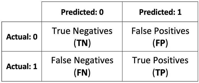
Image 1 — Confusion matrix (image by author)
That’s great, but let’s make it a bit less abstract by putting actual values:
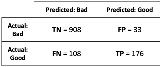
Image 2 — Confusion matrix with real data (image by author)
You can calculate dozens of different metrics from here, precision and recall being two of them.
Precision
Precision is a metric that shows the number of correct positive predictions. It is calculated as the number of true positives divided by the sum of true positives and false positives:
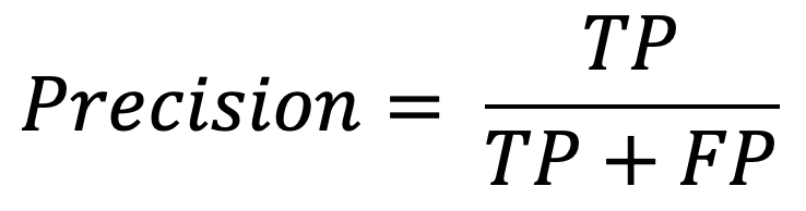
Image 3 — Precision formula (image by author)
Two terms to clarify:
- True positive— an instance that was positive and classified as positive (good wine classified as a good wine)
- False positive— an instance that is negative but classified as positive (bad wine classified as good)
You can now easily calculate the precision score from the confusion matrix shown in Image 2. Here’s the procedure:
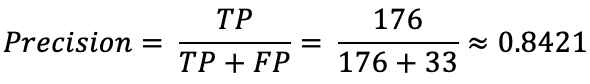
Image 4 — Precision calculation (image by author)
The value can range between 0 and 1 (higher is better) for precision and recall, so 0.84 isn’t too bad.
High precision value means your model doesn’t produce a lot of false positives.
Recall
Recall is the most useful metric for many classification problems. It reports the number of correct predictions for the positive class made out of all positive class predictions. You can calculate it with the following formula:
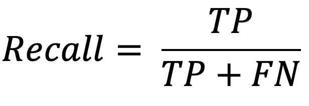
Image 5 — Recall formula (image by author)
Two terms to clarify:
- True positive— an instance that was positive and classified as positive (good wine classified as a good wine)
- False negative— an instance that was positive but classified as negative (good wine classified as bad)
Sure, it’s all fun and games when classifying wines, but the cost of misclassification can be expressed in human lives: a patient has cancer, but the doctor says he doesn’t. Same principle as with wines, but much more costly.
You can calculate the recall score from the formula mentioned above. Here’s a complete walkthrough:
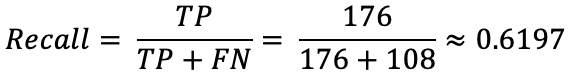
Image 6 — Recall calculation (image by author)
Just as precision, recall also ranges between 0 and 1 (higher is better). 0.61 isn’t that great.
Low recall value means your model produces a lot of false negatives.
You now know how both of these metrics work independently. Let’s connect them to a single visualization next.
Dataset loading and preparation
You’ll use the White wine quality dataset for the practical part. Here’s how to load it with Python:
import numpy as np
import pandas as pd
import matplotlib.pyplot as plt
from matplotlib import rcParams
rcParams['axes.spines.top'] = False
rcParams['axes.spines.right'] = False


df = pd.read_csv('winequality-white.csv', sep=';')
df.head()
Here’s how the first couple of rows look like:
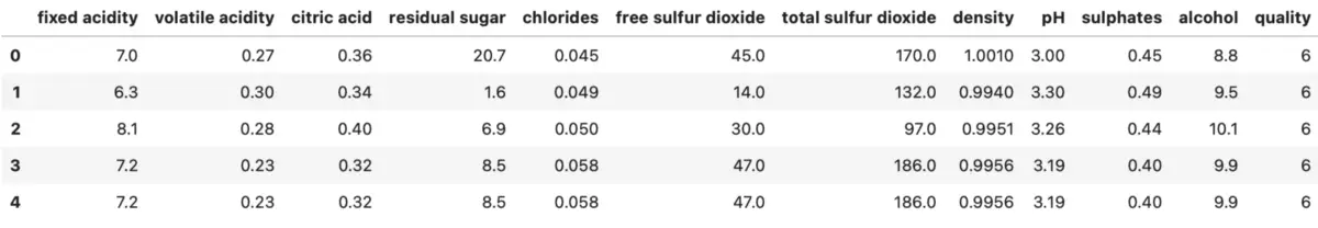
Image 7 — White wine dataset head (image by author)
As you can see from the quality column, this is not a binary classification problem – so you’ll turn it into one. Let’s say the wine is Good if the quality is 7 or above, and Bad otherwise:
df['quality'] = ['Good' if quality >= 7 else 'Bad' for quality in df['quality']]
Next, let’s visualize the target variable distribution. Here’s the code:
ax = df['quality'].value_counts().plot(kind='bar', figsize=(10, 6), fontsize=13, color='#087E8B')
ax.set_title('Counts of Bad and Good vines', size=20, pad=30)
ax.set_ylabel('Count', fontsize=14)

for i in ax.patches:
    ax.text(i.get_x() + 0.19, i.get_height() + 100, str(round(i.get_height(), 2)), fontsize=15)
And here’s the visualization:
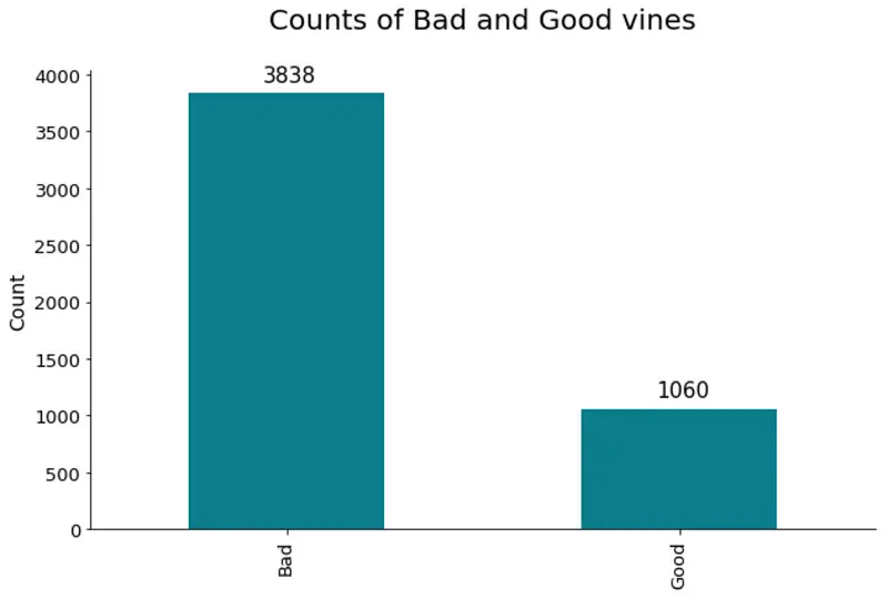
Image 8 — Class distribution of the target variable (image by author)
Roughly a 4:1 ratio, indicating a skew in the target variable. There are many more bad wines, meaning the model will learn to classify bad wines better. You could use oversampling/undersampling techniques to overcome this issue, but it’s beyond the scope for today.
You can make a train/test split next:
from sklearn.model_selection import train_test_split

X = df.drop('quality', axis=1)
y = df['quality']

X_train, X_test, y_train, y_test = train_test_split(
    X, y, test_size=0.25, random_state=42
)
And that’s it! You’ll train a couple of models and visualize precision-recall curves next.
Comparing Precision-Recall curves
The snippet below shows you how to train logistic regression, decision tree, random forests, and extreme gradient boosting models. It also shows you how to grab probabilities for the positive class:
from sklearn.linear_model import LogisticRegression
from sklearn.tree import DecisionTreeClassifier
from sklearn.ensemble import RandomForestClassifier
from xgboost import XGBClassifier

model_lr = LogisticRegression().fit(X_train, y_train)
probs_lr = model_lr.predict_proba(X_test)[:, 1]

model_dt = DecisionTreeClassifier().fit(X_train, y_train)
probs_dt = model_dt.predict_proba(X_test)[:, 1]

model_rf = RandomForestClassifier().fit(X_train, y_train)
probs_rf = model_rf.predict_proba(X_test)[:, 1]

model_xg = XGBClassifier().fit(X_train, y_train)
probs_xg = model_xg.predict_proba(X_test)[:, 1]
You can obtain the values for precision, recall, and AUC (Area Under the Curve) for every model next. The only requirement is to remap the Good and Bad class names to 1 and 0, respectively:
from sklearn.metrics import auc, precision_recall_curve

y_test_int = y_test.replace({'Good': 1, 'Bad': 0})

baseline_model = sum(y_test_int == 1) / len(y_test_int)

precision_lr, recall_lr, _ = precision_recall_curve(y_test_int, probs_lr)
auc_lr = auc(recall_lr, precision_lr)

precision_dt, recall_dt, _ = precision_recall_curve(y_test_int, probs_dt)
auc_dt = auc(recall_dt, precision_dt)

precision_rf, recall_rf, _ = precision_recall_curve(y_test_int, probs_rf)
auc_rf = auc(recall_rf, precision_rf)

precision_xg, recall_xg, _ = precision_recall_curve(y_test_int, probs_xg)
auc_xg = auc(recall_xg, precision_xg)
Finally, you can visualize precision-recall curves:
plt.figure(figsize=(12, 7))
plt.plot([0, 1], [baseline_model, baseline_model], linestyle='--', label='Baseline model')
plt.plot(recall_lr, precision_lr, label=f'AUC (Logistic Regression) = {auc_lr:.2f}')
plt.plot(recall_dt, precision_dt, label=f'AUC (Decision Tree) = {auc_dt:.2f}')
plt.plot(recall_rf, precision_rf, label=f'AUC (Random Forests) = {auc_rf:.2f}')
plt.plot(recall_xg, precision_xg, label=f'AUC (XGBoost) = {auc_xg:.2f}')
plt.title('Precision-Recall Curve', size=20)
plt.xlabel('Recall', size=14)
plt.ylabel('Precision', size=14)
plt.legend();
Here’s the corresponding visualization:
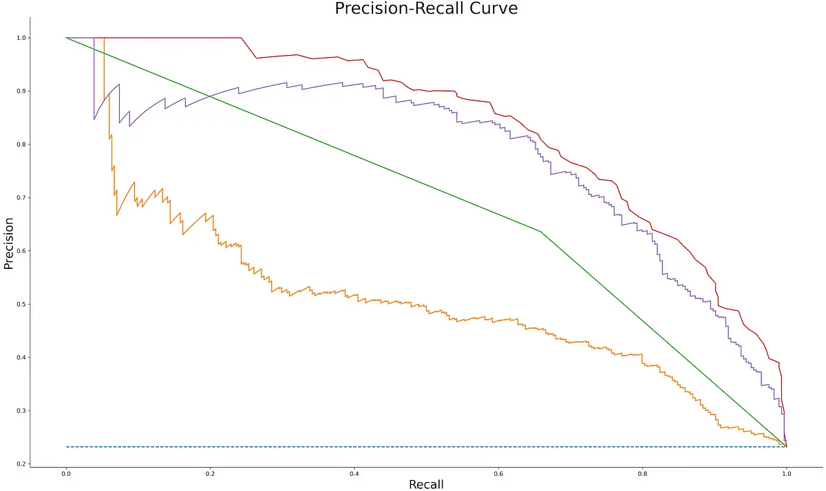
Image 9 — Precision-Recall curves for different machine learning models (image by author)
As you can see, none of the curves stretch up to (1, 1) point, but that’s expected. The AUC value is an excellent metric for comparing different models (higher is better). Random forests algorithm did best on this dataset, with an AUC score of 0.83.
Conclusion
To summarize, you should visualize precision-recall curves any time you want to visualize the tradeoff between false positives and false negatives. A high number of false positives leads to low precision, and a high number of false negatives leads to low recall.
You should aim for high-precision and high-recall models, but in reality, one metric is more important, so you can always optimize for it. After optimization, adjust the classification threshold accordingly.
What’s your approach to model selection? Let me know in the comment section.
Learn More
- Python If-Else Statement in One Line - Ternary Operator Explained
- Python Structural Pattern Matching - Top 3 Use Cases to Get You Started
- Dask Delayed - How to Parallelize Your Python Code With Ease
Stay connected
- Sign up for my newsletter
- Subscribe on YouTube
- Connect on LinkedIn