In-depth comparison of the two most popular visualization libraries
2020 is coming to an end (finally), and data visualization was never more important. Presenting something that looks like a 5-year-old made it is no longer an option, so data scientists need an attractive and simple-to-use data visualization library. We’ll compare two of these today —Matplotlib and ggplot2.
So, why these two? I’ll take my chances and say those are the first visualization libraries you’ll learn, depending on the programming language choice. I’ve grown to like ggplot2 a bit more, but today we’ll recreate five identical plots in both libraries and see how things go, both code-wise and aesthetics-wise.
What about the data? We’ll use two well-known datasets: mtcars and airline passengers. You can obtain the first through RStudio via the export CSV functionality, and the second is available here.
Here are the library imports for both R and Python:
R:
library(ggplot2)
Python:
import pandas as pd
import matplotlib.pyplot as plt
import matplotlib.dates as mdates
mtcars = pd.read_csv('mtcars.csv')
Histograms
We use histograms to visualize the distribution of a given variable. That’s just what we’ll do with the mtcars dataset — visualize the distribution of the MPG attribute.
Here is the code and results for R:
ggplot(mtcars, aes(x=mpg)) +
  geom_histogram(bins=15, fill='#087E8B', color='#02454d') +
  ggtitle('Histogram of MPG') + xlab('MPG') + ylab('Count')
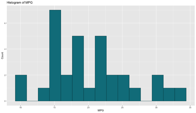
Image by author
And here’s the same for Python:
plt.figure(figsize=(12, 7))
plt.hist(mtcars['mpg'], bins=15, color='#087E8B', ec='#02454d')
plt.title('Histogram of MPG')
plt.xlabel('MPG')
plt.ylabel('Count');
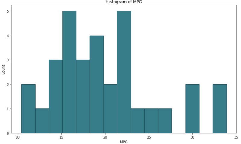
Image by author
Both are very similar by default. Even the amount of code we need to write is more or less the same, so it’s hard to pick a favorite here. I like how Python’s x-axis starts from 0, but that can be easily altered in R. On the other hand, I like the lack of borders in R, but again, that’s something easy to implement in Python.
Winner: draw
Bar chart
Bar charts are made of different height rectangles, where the height represents the value for a given attribute segment. We’ll use them to compare counts for a different number of cylinders (attribute cyl).
Here is the code and results for R:
ggplot(mtcars, aes(x=cyl)) +
  geom_bar(fill='#087E8B', color='#02454d') +
  scale_x_continuous(breaks=seq(min(mtcars$cyl), max(mtcars$cyl), by=2)) +
  ggtitle('Bar chart of CYL') +
  xlab('Number of cylinders') + ylab('Count')
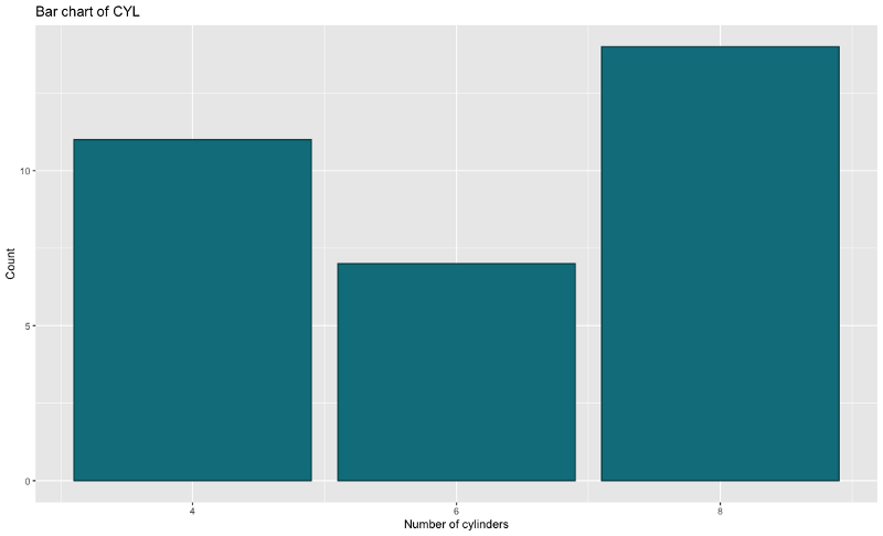
Image by author
And here’s the same for Python:
bar_x = mtcars['cyl'].value_counts().index
bar_height = mtcars['cyl'].value_counts().values
plt.figure(figsize=(12, 7))
plt.bar(x=bar_x, height=bar_height, color='#087E8B', ec='#02454d')
plt.xticks([4, 6, 8])
plt.title('Bar chart of CYL')
plt.xlabel('Number of cylinders')
plt.ylabel('Count');
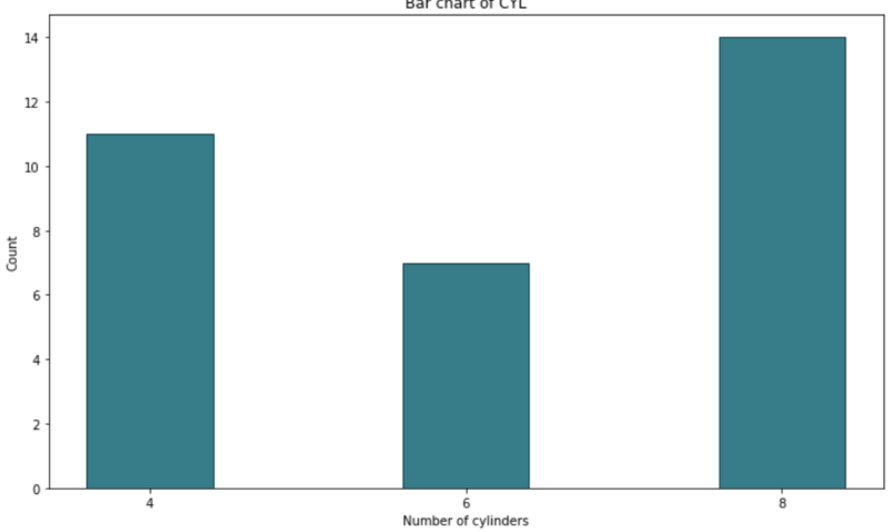
Image by author
There’s no arguing that R’s code is much tidier and simpler, as _Python_requires manual height calculation. Aesthetic-wise they are very similar, but I prefer the R version a bit more.
Winner: ggplot2
Scatter plots
Scatter plots are used to visualize relationships between two variables. The idea is to see what happens to the second variable as the first one changes (goes up or down). We can also add another ‘dimension’ to the 2-dimensional plot by coloring the points from other attribute values.
We’ll use the scatter plot to visualize the relationship between HP and MPG attributes.
Here is the code and results for R:
ggplot(mtcars, aes(x=hp, y=mpg)) +
  geom_point(aes(size=cyl, color=cyl)) +
  ggtitle('Scatter plot of HP vs MPG') +
  xlab('Horse power') + ylab('Miles per gallon')
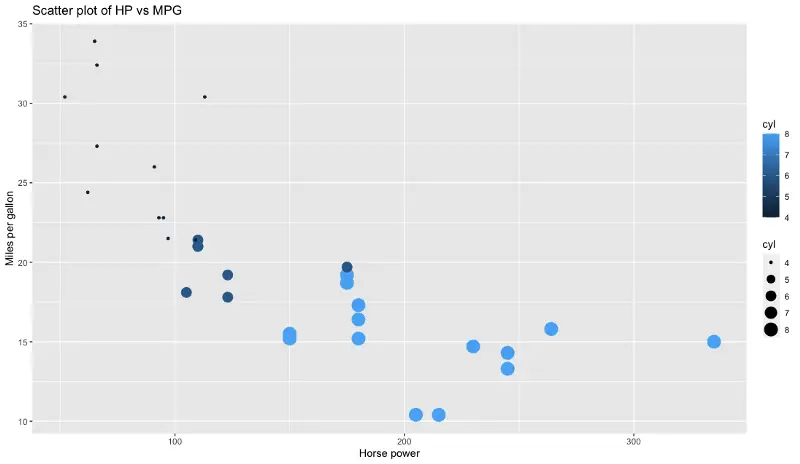
Image by author
And here’s the same for Python:
colors = []
for val in mtcars['cyl']:
    if val == 4: colors.append('#17314c')
    elif val == 6: colors.append('#326b99')
    else: colors.append('#54aef3')

plt.figure(figsize=(12, 7))
plt.scatter(x=mtcars['hp'], y=mtcars['mpg'], s=mtcars['cyl'] * 20, c=colors)
plt.title('Scatter plot of HP vs MPG')
plt.xlabel('Horse power')
plt.ylabel('Miles per gallon');
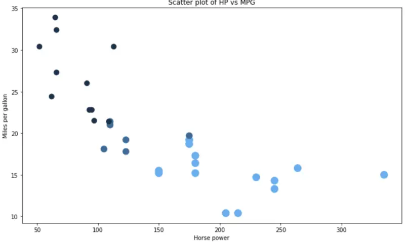
Image by author
Code-wise it’s a clear win for R and ggplot2. Matplotlib doesn’t offer an easy way to color data points by some third attribute, so we have to do that step manually. The sizing is also a bit weird.
Winner: ggplot2
Boxplots
Boxplots are used to visualize the data through their quartiles. It’s common for them to have lines (whiskers) extending from the boxes, and those display variability outside the upper and lower quartiles. The line in the middle is the median value. Dots shown on top or bottom (after the whiskers) are considered to be outliers.
We’ll use a boxplot to visualize MPG by different CYL values.
Here is the code and results for R:
ggplot(mtcars, aes(x=as.factor(cyl), y=mpg)) +
  geom_boxplot(fill='#087E8B', alpha=0.6) +
  ggtitle('Boxplot of CYL vs MPG') +
  xlab('Number of cylinders') + ylab('Miles per gallon')
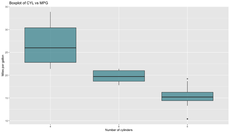
Image by author
And here’s the same for Python:
boxplot_data = [
    mtcars[mtcars['cyl'] == 4]['mpg'].tolist(),
    mtcars[mtcars['cyl'] == 6]['mpg'].tolist(),
    mtcars[mtcars['cyl'] == 8]['mpg'].tolist()
]

fig = plt.figure(1, figsize=(12, 7))
ax = fig.add_subplot(111)
bp = ax.boxplot(boxplot_data, patch_artist=True)

for box in bp['boxes']:
    box.set(facecolor='#087E8B', alpha=0.6, linewidth=2)

for whisker in bp['whiskers']:
    whisker.set(linewidth=2)

for median in bp['medians']:
    median.set(color='black', linewidth=3)

ax.set_title('Boxplot of CYL vs MPG')
ax.set_xlabel('Number of cylinders')
ax.set_ylabel('Miles per galon')
ax.set_xticklabels([4, 6, 8]);
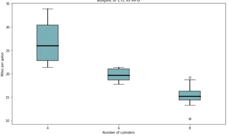
Image by author
One thing is immediately visible — Matplotlib requires so much code to produce a decent-looking boxplot. That’s not the case with ggplot2. R is the obvious winner here, by far.
Winner: ggplot2
Line chart
We’ll now move away from the mtcars dataset to the airline passengers dataset. We’ll use it to create a simple line chart with a date-formatted x-axis. It’s not as easy as it sounds.
Here is the code and results for R:
ap <- read.csv('https://raw.githubusercontent.com/jbrownlee/Datasets/master/airline-passengers.csv')
ap$Month <- as.Date(paste(ap$Month, '-01', sep=''))

ggplot(ap, aes(x=Month, y=Passengers)) +
  geom_line(size=1.5, color='#087E8B') +
  scale_x_date(date_breaks='1 year', date_labels='%Y') +
  ggtitle('Line chart of Airline passengers') +
  xlab('Year') + ylab('Count')
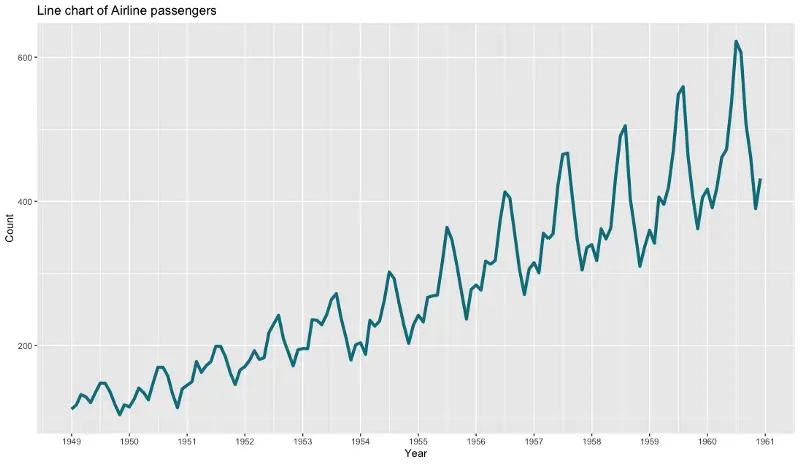
Image by author
And here’s the same for Python:
ap = pd.read_csv('https://raw.githubusercontent.com/jbrownlee/Datasets/master/airline-passengers.csv')
ap['Month'] = ap['Month'].apply(lambda x: pd.to_datetime(f'{x}-01'))

fig = plt.figure(1, figsize=(12, 7))
ax = fig.add_subplot(111)
line = ax.plot(ap['Month'], ap['Passengers'], lw=2.5, color='#087E8B')

formatter = mdates.DateFormatter('%Y')
ax.xaxis.set_major_formatter(formatter)
locator = mdates.YearLocator()
ax.xaxis.set_major_locator(locator)
ax.set_title('Line chart of Airline passengers') ax.set_xlabel('Year') ax.set_ylabel('Count');

Image by author
The plots are pretty much identical, aesthetics-wise, but ggplot2 beats Matplotlib once again when it comes to code amount. It’s also much easier to format the x-axis to display dates in R than it is in Python.
Winner: ggplot2
Before you go
In my opinion, ggplot2 is a clear winner when it comes to simple and good-looking data visualization. Almost always it boils down to very similar 3–5 lines of code, which is not the case with Python.
We haven’t touched a bit on plot customization, as the idea was to compare the ‘default’ stylings of the ‘default’ visualization libraries. Feel free to explore further on your own.
Thanks for reading.