
Ditch the Binning bias once and for all with ECDFs
Everybody loves a good data visualization. Still, they shouldn’t leave the interpretation to the viewer, as it’s the case with histograms. Today we’ll answer how binning bias can mislead you in the analysis and how to prevent this issue with the power of ECDF plots.
The article answers the following questions:
- What’s wrong with histograms — and when should you avoid them
- How to replace histograms with ECDFs — a more robust method for examining data distributions
- How to use and interpret multiple ECDFs in a single chart — to compare distributions among different data segments
Without much ado, let’s get started!
What’s wrong with histograms?
As Justin Bois from DataCamp said — binning bias — and I can’t agree more. What this means is that using different bin sizes on a histogram makes data distribution look different. Don’t take my word for it — the example below speaks for itself.
To start, we’ll import a couple of libraries for data analysis and visualization, and load the Titanic dataset straight from the web:
import numpy as np
import pandas as pd
import matplotlib.pyplot as plt
import seaborn as sns
sns.set()

df = pd.read_csv('https://raw.githubusercontent.com/datasciencedojo/datasets/master/titanic.csv')
If you are unfamiliar with the dataset, here’s how the first couple of rows look like:
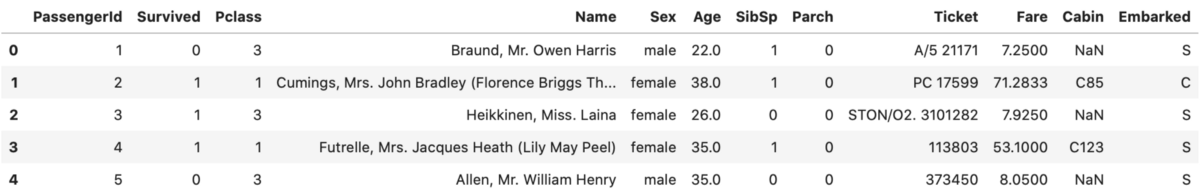
Image by author
df.dropna(subset=['Age'], inplace=True)
Next, let’s declare a function for visualizing histograms. It takes a bunch of parameters, but the most important ones in our case are:
x– indicates a single attribute we want to draw a histogram fornbins– how many bins the histogram should have
def plot_histogram(x, size=(14, 8), nbins=10, title='Histogram', xlab='Age', ylab='Count'):
    plt.figure(figsize=size)
    plt.hist(x, bins=nbins, color='#087E8B')
    plt.title(title, size=20)
    plt.xlabel(xlab, size=14)
    plt.ylabel(ylab, size=14)

plot_histogram(df['Age'], title='Histogram of passenger ages')
plot_histogram(df['Age'], nbins=30, title='Histogram of passenger ages')
We will use the mentioned function two times, the first time to make a histogram with 10 bins, and the second time to make a histogram with 30 bins. Here are the results:
Histogram with 10 bins:
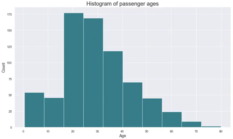
Image by author
Histogram with 30 bins:
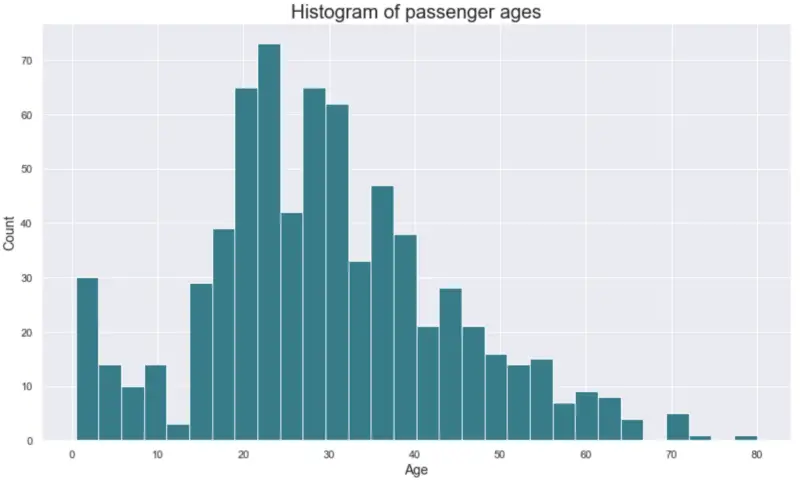
Image by author
he data is identical, but different bin sizes can lead to binning bias— perceiving the same data differently, due to a slight change in the visual representations.
What can we do to address this issue? ECDF plots are here to save the day.
ECDFs — a more robust histogram replacement
ECDF stands for the Empirical Cumulative Distribution Function. Don’t worry, it’s way less fancy than it sounds, and is also relatively easy to interpret.
Like histograms, ECDFs show a single variable distribution, but in a more efficient way. We’ve seen previously how histograms can be misleading due to different bin sizing options. That’s not the case with ECDFs. ECDFs show every data point, and the plot can be interpreted only in one way.
Think of ECDFs as scatter plots because they also have points along X and Y axes. To be more precise, here’s what ECDFs show on both axes:
- X-axis — a quantity we are measuring (Age in the example above)
- Y-axis — the percentage of data points that have a smaller value than the respective X value (at each point X, Y% of the values are smaller or identical to X)
To make this sort of visualization, we need to do a bit of calculation first. Two arrays are required:
- X — sorted data (sorting the Age column from lowest to highest)
- Y — list of evenly spaced data points where the maximum is 1 (as in 100%)
The following Python snippet can be used to calculate X and Y values for a single column in a Pandas DataFrame:
def ecdf(df, column):
    x = np.sort(df[column])
    y = np.arange(1, len(x) + 1) / len(x)
    return x, y
It was quite a simple one. We’ll need one more function, though. This one is used to make an actual chart:
def plot_ecdf(x, y, size=(14, 8), title='ECDF', xlab='Age', ylab='Percentage', color='#087E8B'):
    plt.figure(figsize=size)
    plt.scatter(x, y, color=color)
    plt.title(title, size=20)
    plt.xlabel(xlab, size=14)
    plt.ylabel(ylab, size=14)
Let’s use this function to make an ECDF plot of the Age attribute:
x, y = ecdf(df, 'Age')

plot_ecdf(x, y, title='ECDF of passenger ages', xlab='Age')
plt.show()
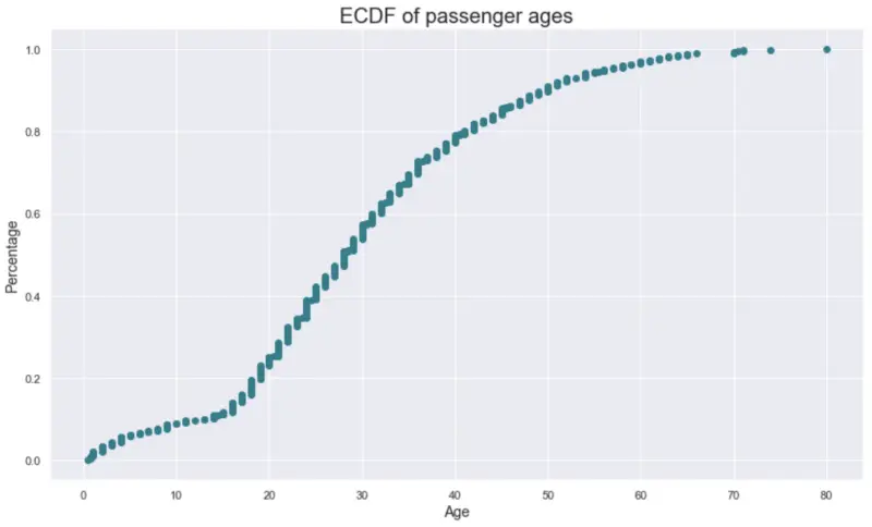
Image by author
But wait, how do I interpret this? It’s quite easy. Here are a couple of examples:
- Around 25% of the passengers are 20 years old or younger
- Around 80% of the passengers are 40 years old or younger
- Around 5% of the passengers are 60 years old or older (1 — the percentage)
Wasn’t that easy? But wait, the party doesn’t stop here. Let’s explore how to plot and interpret multiple ECDFs next.
Multiple ECDFs
In the Titanic dataset, we have the Pclass attribute, which indicates the passenger class. This sort of class organization is typical in travel even today, as the first class is reserved for wealthier individuals, and the other classes are where the rest of the folk is located.
With the power of ECDFs, we can explore how the passenger age was distributed among classes. We’ll need to call the ecdf() function 3 times, as there were three classes on the ship. The rest of the code boils down to data visualization, which is self-explanatory:
x1, y1 = ecdf(df[df['Pclass'] == 1], 'Age')
x2, y2 = ecdf(df[df['Pclass'] == 2], 'Age')
x3, y3 = ecdf(df[df['Pclass'] == 3], 'Age')

plt.figure(figsize=(14, 8))
plt.scatter(x1, y1, color='#087E8B')
plt.scatter(x2, y2, color='#f1c40f')
plt.scatter(x3, y3, color='#e74c3c')
plt.title('ECDF of ages across passenger classes', size=20)
plt.xlabel('Age', size=14)
plt.ylabel('Percentage', size=14)
plt.legend(labels=['Pclass = 1', 'Pclass = 2', 'Pclass = 3'])
plt.show()
The resulting visualization is shown below:
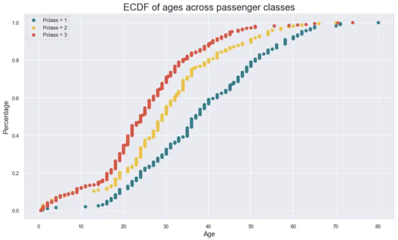
Image by author
As we can see, the third class (red) had a lot of children on board, which isn’t the case all that much with the first class (green). The population in the first class is quite older, too:
- only 20% of the first-class passengers are older than 50 years
- only 20% of the second-class passengers are older than 40 years
- only 20% of the third-class passengers are older than 34 years
These are just rough numbers, so don’t quote me if I made a mistake by a year or two. Now you know how to work with and interpret ECDFs. Let’s wrap things up in the next section.
Parting words
Don’t leave anything to the personal interpretation in data science. Just because you like to see 15 bins in a histogram doesn’t mean your coworker likes it too. These differences might lead to different data interpretations if interpreted visually.
That’s not the case with ECDFs. You now know enough about them so you can include them in the next data analysis project. They can seem daunting at first, but I hope this article made the necessary clarifications.
Thanks for reading.