
Don’t one-hot encode date information. Do this instead.
Today we’ll look at a common but poorly understood topic in data science — cyclical data. It’s a part of many datasets and is easily spottable — date information is the most common form. There are plenty of approaches to encode date information to something machine-learning-friendly, but some are better than others.
Here’s how I was taught about dealing with date values —treat them as categorical. Different months/days/hours can be treated as individual categories, so to encode them, one can create a bunch of dummy variables. For example, when dealing with monthly data, we can make 11 dummy columns (one-hot) that take the form of Is_January, Is_February, and so on, where only one column can have a non-zero value for a row.
That’s just wrong.
Sure, you can do that, and a machine learning model wouldn’t complain, but it doesn’t mean it’s the right approach. Time data is cyclical, as one hour has 60 minutes, and one day has 24 hours. When an hour completes, the next one starts counting minutes from zero.
It makes the 1st and 2nd minute of an hour strongly connected, but it also makes the 59th and 1st minute connected, as there’s only one minute difference, not 59 as a model would assume.
And that’s the behavior we want. The next section will make the previous points more clear.
Dataset introduction and loading
We need a dataset with some date or other cyclical attributes — that’s obvious. A quick Kaggle search resulted in this Hourly Energy Consumption dataset, of which we’ll use the first AEP_hourly.csv file. It’s a couple of MB in size, so download it to your machine.
The first couple of rows look like this, once loaded with Pandas:
import pandas as pd

df = pd.read_csv('data/AEP_hourly.csv.zip')
df.head()
Image by author
Great — we have some date information, but is it an actual date or a string?
df.dtypes
Image by author
Just as expected, so let’s make a conversion. We’ll also extract the hour information from the date, as that’s what we’re dealing with.
df['Datetime'] = pd.to_datetime(df['Datetime'])
df['Hour'] = df['Datetime'].dt.hour

df.head()
Image by author
Things are much better now. Let’s isolate the last week’s worth of data (the last 168 records) to visualize why one-hot encoding isn’t a good thing to do.
last_week = df.iloc[-168:]
import matplotlib.pyplot as plt

plt.title('Individual hours', size=20)
plt.plot(range(len(last_week)), last_week['Hour'])
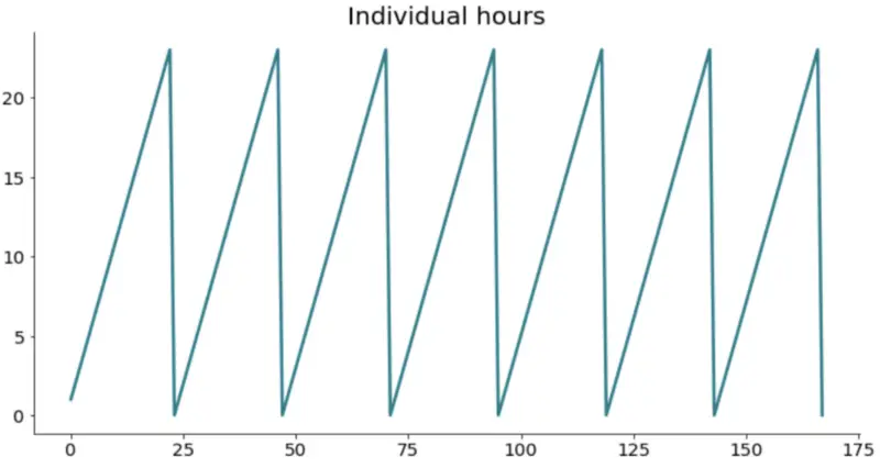
Image by author
Expected behavior. It’s a cycle that repeats seven times (7 days), and there’s a rough cut off every day after the 23rd hour. I think you can easily reason why this type of behavior isn’t optimal for cyclical data.
But what can we do about it? Luckily, a lot.
Encoding cyclical data
One-hot encoding wouldn’t be that wise of thing to do in this case. We’d end up with 23 additional attributes (n — 1), which is terrible for two reasons:
- Massive jump in dimensionality — from 2 to 24
- No connectivity between attributes — hour 23 doesn’t know it’s followed by hour 0
So, what can we do?
Use a sine an cosine transformations. Here are the formulas we’ll use:
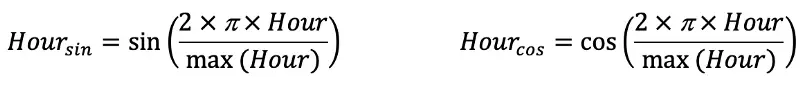
Image by author
Or, in Python:
import numpy as np last_week['Sin_Hour'] = np.sin(2 * np.pi * last_week['Hour'] / max(last_week['Hour'])) last_week['Cos_Hour'] = np.cos(2 * np.pi * last_week['Hour'] / max(last_week['Hour']))
Awesome! Here’s how the last week of data now looks:
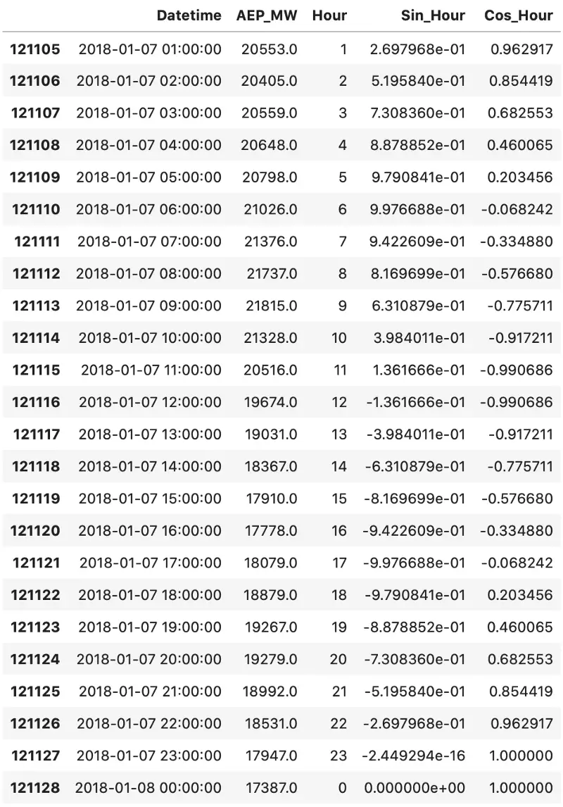
Image by author
These transformations allowed us to represent time data in a more meaningful and compact way. Just take a look at the last two rows. Sine values are almost identical, but still a bit different. The same goes for every following hour, as it now follows a waveform.
That’s great, but why do we need both functions?
Let’s explore the functions graphically before I give you the answer.
Image by author
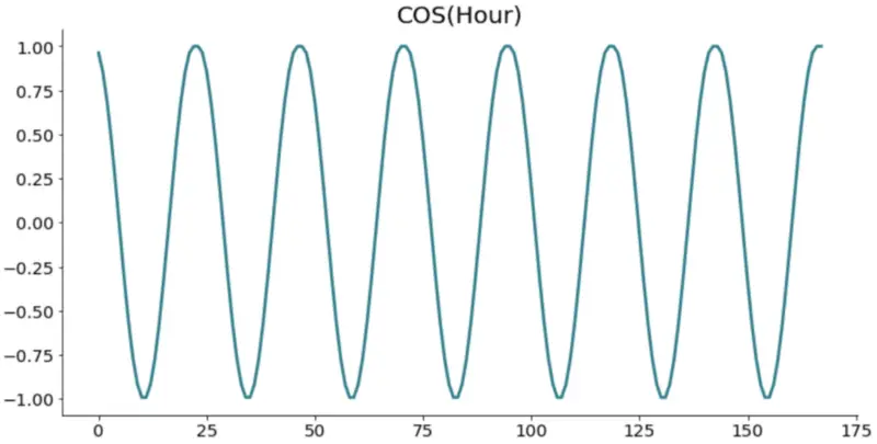
Image by author
Look at one graph at a time. There’s a problem. The values repeat. Just take a look at the sine function, somewhere between 24 and 48, on the x-axis. If you were to draw a straight line, it would intersect with two points for the same day. That’s not the behavior we want.
To further prove this point, here’s what happens if we draw a scatter plot of both sine and cosine columns:
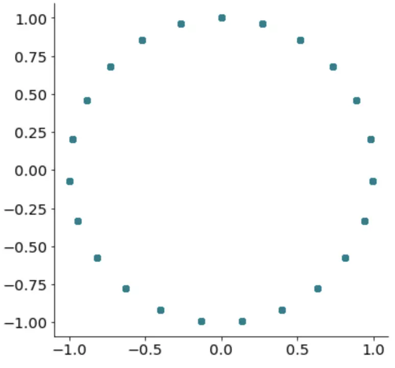
Image by author
That’s right; we get a perfect cycle. It only makes sense to represent cyclical data with a cycle, don’t you agree?
That’s all you should know. Let’s wrap things up in the next section.
Before you go
This was relatively short and to the point article, but I still hope I managed to convince you one-hot encoding isn’t a solution for everything. Sure, it works like a charm when categorical attributes aren’t ‘connected’ in any way, but this is the go-to approach for any cyclical data.
One may argue that we introduce two new dimensions, which isn’t ideal. I agree, but two are better than 23, which resulted from a one-hot encoding approach.
Thanks for reading.