Create PDF reports with beautiful visualizations in 10 minutes or less
Reports are everywhere, so any tech professional must know how to create them. It’s a tedious and time-consuming task, which makes it a perfect candidate for automation with Python.
You can benefit from an automated report generation whether you’re a data scientist or a software developer. For example, data scientists might use reports to show performance or explanations of machine learning models.
This article will teach you how to make data-visualization-based reports and save them as PDFs. To be more precise, you’ll learn how to combine multiple data visualizations (dummy sales data) into a single PDF file.
And the best thing is — it’s easier than you think!
You can download the Notebook with the source code here.
Data generation
You can’t have reports without data. That’s why you’ll have to generate some first — more on that in a bit.
Let’s start with the imports. You’ll need a bunch of things — but the FPDF library is likely the only unknown. Put simply, it’s used to create PDFs, and you’ll work with it a bit later. Refer to the following snippet for the imports:
import os
import shutil
import numpy as np
import pandas as pd
import calendar
from datetime import datetime
from fpdf import FPDF

import matplotlib.pyplot as plt
from matplotlib import rcParams
rcParams['axes.spines.top'] = False
rcParams['axes.spines.right'] = False
Let’s generate some fake data next. The idea is to declare a function that returns a data frame of dummy sales data for a given month. It does that by constructing a date range for the entire month and then assigning the sales amount as a random integer within a given range.
You can use the calendar library to get the last day for any year/month combination. Here’s the entire code snippet:
def generate_sales_data(month: int) -> pd.DataFrame:
    # Date range from first day of month until last
    # Use ```calendar.monthrange(year, month)``` to get the last date
    dates = pd.date_range(
        start=datetime(year=2020, month=month, day=1),
        end=datetime(year=2020, month=month, day=calendar.monthrange(2020, month)[1])
    )

    # Sales numbers as a random integer between 1000 and 2000
    sales = np.random.randint(low=1000, high=2000, size=len(dates))

    # Combine into a single dataframe
    return pd.DataFrame({
        'Date': dates,
        'ItemsSold': sales
    })

# Test
generate_sales_data(month=3)
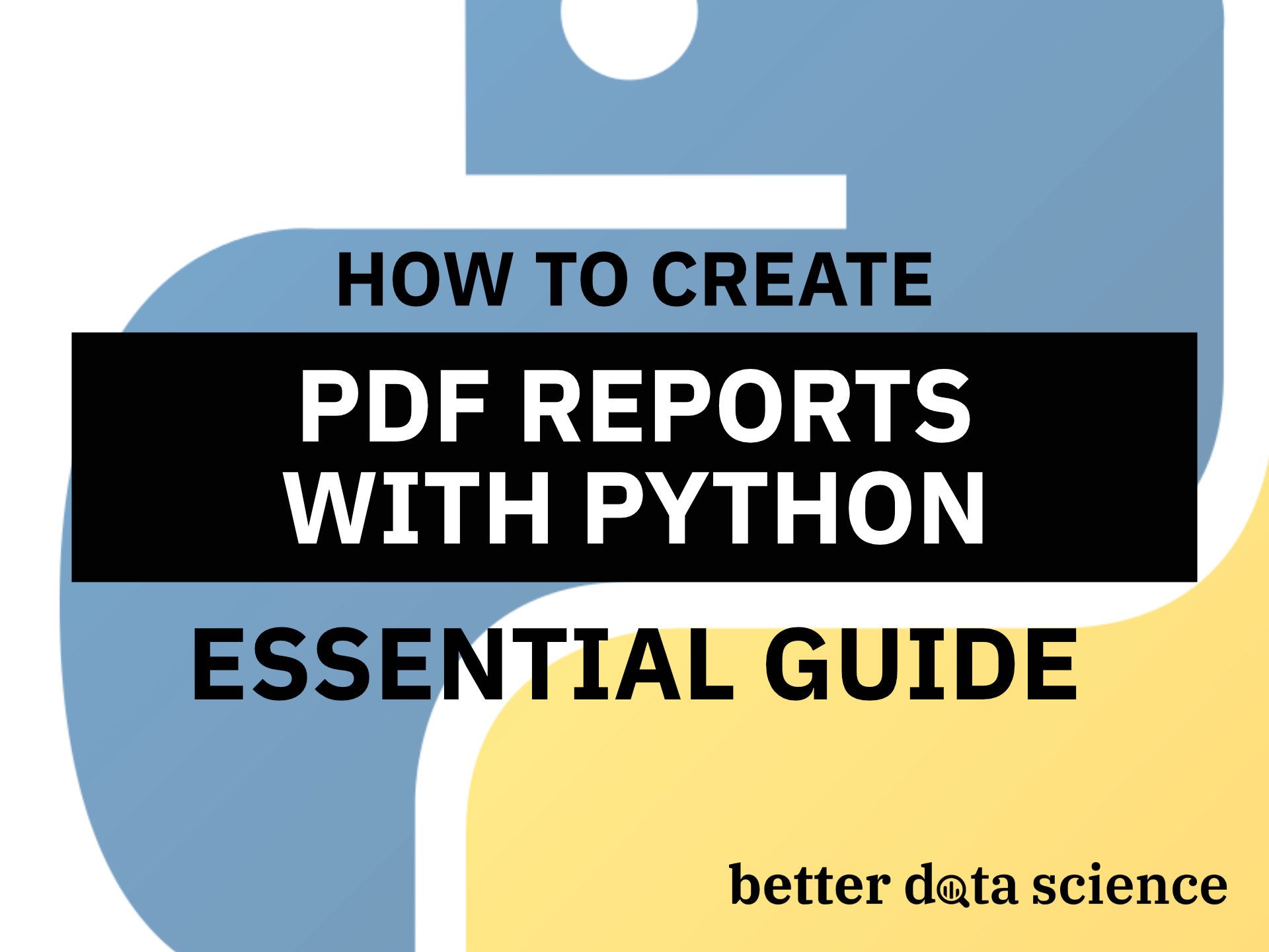
A call to generate_sales_data(month=3) generated 31 data points for March of 2020. Here’s how the first couple of rows look like:
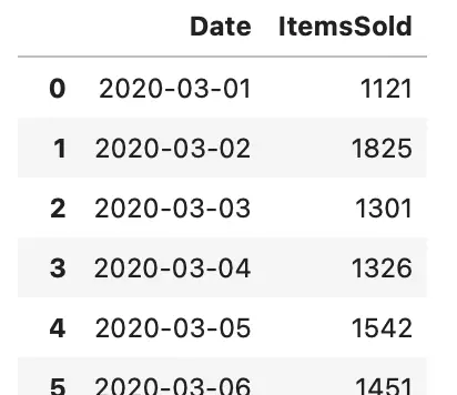
Image 1 — Sample of generated data (image by author)
And that’s it — you now have a function that generates dummy sales data. Let’s see how to visualize it next.
Data visualization
Your next task is to create a function that visualizes the earlier created dataset as a line plot. It’s the most appropriate visualization type, as you’re dealing with time series data.
Here’s the function for data visualization and an example call:
def plot(data: pd.DataFrame, filename: str) -> None:
    plt.figure(figsize=(12, 4))
    plt.grid(color='#F2F2F2', alpha=1, zorder=0)
    plt.plot(data['Date'], data['ItemsSold'], color='#087E8B', lw=3, zorder=5)
    plt.title(f'Sales 2020/{data["Date"].dt.month[0]}', fontsize=17)
    plt.xlabel('Period', fontsize=13)
    plt.xticks(fontsize=9)
    plt.ylabel('Number of items sold', fontsize=13)
    plt.yticks(fontsize=9)
    plt.savefig(filename, dpi=300, bbox_inches='tight', pad_inches=0)
    plt.close()
    return

# Test
december = generate_sales_data(month=12)
plot(data=december, filename='december.png')
In a nutshell — you’re creating data visualization, setting the title, playing around with fonts — nothing special. The visualization isn’t shown to the user but is instead saved to the machine. You’ll see later how powerful this can be.
An example call will save a data visualization for December of 2020. Here’s how it looks like:
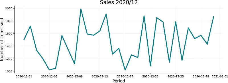
Image 2 — Sales for December/2020 plot (image by author)
And that’s your visualization function. There’s only one step remaining before you can create PDF documents, and that is to save all the visualization and define the report page structure.
Create a PDF page structure
The task now is to create a function that does the following:
- Creates a folder for charts — deletes if it exists and re-creates it
- Saves a data visualization for every month in 2020 except for January — so you can see how to work with different number of elements per page (feel free to include January too)
- Creates a PDF matrix from the visualizations — a 2-dimensional matrix where a row represents a single page in the PDF report
Here’s the code snippet for the function:
PLOT_DIR = 'plots'

def construct():
    # Delete folder if exists and create it again
    try:
        shutil.rmtree(PLOT_DIR)
        os.mkdir(PLOT_DIR)
    except FileNotFoundError:
        os.mkdir(PLOT_DIR)

    # Iterate over all months in 2020 except January
    for i in range(2, 13):
        # Save visualization
        plot(data=generate_sales_data(month=i), filename=f'{PLOT_DIR}/{i}.png')

    # Construct data shown in document
    counter = 0
    pages_data = []
    temp = []
    # Get all plots
    files = os.listdir(PLOT_DIR)
    # Sort them by month - a bit tricky because the file names are strings
    files = sorted(os.listdir(PLOT_DIR), key=lambda x: int(x.split('.')[0]))
    # Iterate over all created visualization
    for fname in files:
        # We want 3 per page
        if counter == 3:
            pages_data.append(temp)
            temp = []
            counter = 0

        temp.append(f'{PLOT_DIR}/{fname}')
        counter += 1

    return [*pages_data, temp]
It’s possibly a lot to digest, so go over it line by line. The comments should help. The idea behind sorting is to obtain the month integer representation from the string — e.g., 3 from “3.png” and use this value to sort the charts. Delete this line if the order doesn’t matter, but that’s not the case with months.
Here’s an example call of the construct() function:
plots_per_page = construct()
plots_per_page
You should see the following in your Notebook after running the above snippet:
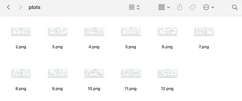
Image 3 — Generated visualizations (image by author)
In case you’re wondering — here’s how the plots/ folder looks on my machine (after calling the construct() function):
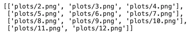
Image 4 — PDF report content matrix (image by author)
And that’s all you need to construct PDF reports — you’ll learn how to do that next.
Create PDF reports
This is where everything comes together. You’ll now create a custom PDF class that inherits from the FPDF. This way, all properties and methods are available in our class, if you don’t forget to call super().__init__() in the constructor. The constructor will also hold values for page width and height (A4 paper).
Your PDF class will have a couple of methods:
header()– used to define the document header. A custom logo is placed on the left (make sure to have one or delete this code line), and a hardcoded text is placed on the rightfooter()– used to define the document footer. It will simply show the page numberpage_body()– used to define how the page looks like. This will depend on the number of visualizations shown per page, so positions are margins are set accordingly (feel free to play around with the values)print_page()– used to add a blank page and fill it with content
Here’s the entire code snippet for the class:
class PDF(FPDF):
    def __init__(self):
        super().__init__()
        self.WIDTH = 210
        self.HEIGHT = 297

    def header(self):
        # Custom logo and positioning
        # Create an `assets` folder and put any wide and short image inside
        # Name the image `logo.png`
        self.image('assets/logo.png', 10, 8, 33)
        self.set_font('Arial', 'B', 11)
        self.cell(self.WIDTH - 80)
        self.cell(60, 1, 'Sales report', 0, 0, 'R')
        self.ln(20)

    def footer(self):
        # Page numbers in the footer
        self.set_y(-15)
        self.set_font('Arial', 'I', 8)
        self.set_text_color(128)
        self.cell(0, 10, 'Page ' + str(self.page_no()), 0, 0, 'C')

    def page_body(self, images):
        # Determine how many plots there are per page and set positions
        # and margins accordingly
        if len(images) == 3:
            self.image(images[0], 15, 25, self.WIDTH - 30)
            self.image(images[1], 15, self.WIDTH / 2 + 5, self.WIDTH - 30)
            self.image(images[2], 15, self.WIDTH / 2 + 90, self.WIDTH - 30)
        elif len(images) == 2:
            self.image(images[0], 15, 25, self.WIDTH - 30)
            self.image(images[1], 15, self.WIDTH / 2 + 5, self.WIDTH - 30)
        else:
            self.image(images[0], 15, 25, self.WIDTH - 30)

    def print_page(self, images):
        # Generates the report
        self.add_page()
        self.page_body(images)
Now it’s time to instantiate it and to append pages from the 2-dimensional content matrix:
pdf = PDF()

for elem in plots_per_page:
    pdf.print_page(elem)

pdf.output('SalesRepot.pdf', 'F')
The above cell will take some time to execute, and will return an empty string when done. That’s expected, as your report is saved to the folder where the Notebook is stored.
Here’s how to first page of the report should look like:
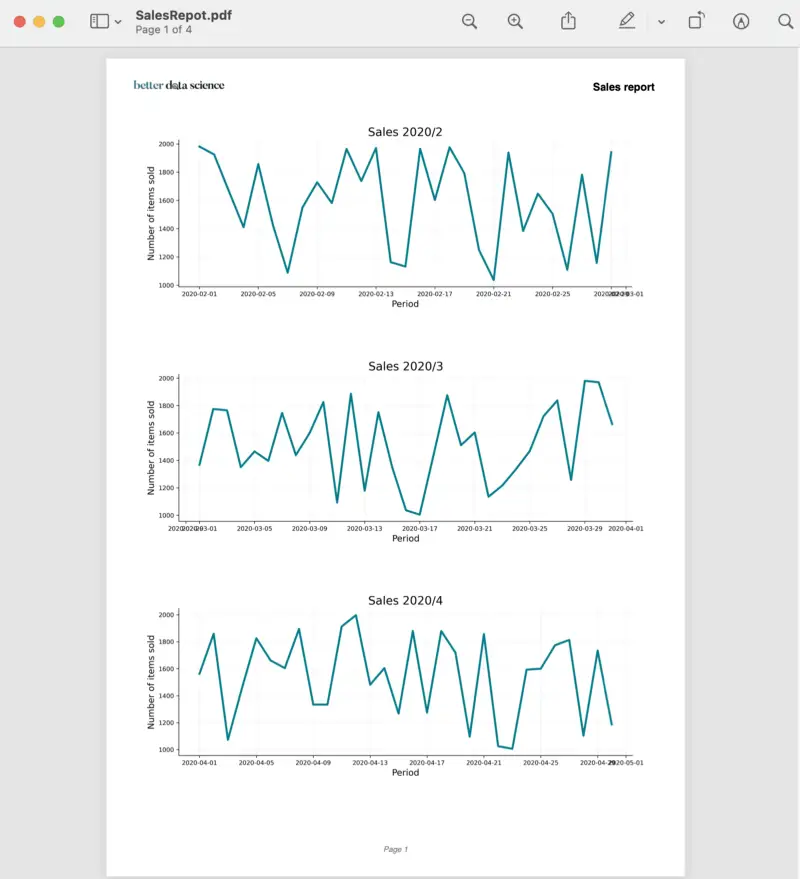
Image 5 — First page of the PDF report (image by author)
Of course, yours will look different due to the different logo and due to sales data being completely random.
And that’s how you create data-visualization-powered PDF reports with Python. Let’s wrap things up next.
Conclusion
You’ve learned many things today — how to create dummy data for any occasion, how to visualize it, and how to embed visualizations into a single PDF report. Embedding your visualizations will require minimal code changes — mostly for positioning and margins.
Let me know if you’d like to see a guide for automated report creation based on machine learning model interpretations (SHAP or LIME) or something else related to data science.
Thanks for reading.
Learn More
- Python If-Else Statement in One Line - Ternary Operator Explained
- Python Structural Pattern Matching - Top 3 Use Cases to Get You Started
- Dask Delayed - How to Parallelize Your Python Code With Ease
Stay connected
- Sign up for my newsletter
- Subscribe on YouTube
- Connect on LinkedIn